CASE STUDY — 2023
Notification Inbox Redesign
Redesigning the notification inbox for a large-scale online grocery marketplace app to reduce noise and improve clarity.
- ROLE
- Product Designer
- TIMELINE
- 3 months (2023)
- TEAM
- 1 PM
- 1 Researcher
- 1 Data Analyst
- Dev Team (10-20)
- OVERVIEW
- While at Weee!, a large-scale Asian e-commerce grocery platform, I led the end-to-end redesign of a legacy Notification Inbox, surfacing key messages users couldn't find, while building a scalable architecture to support aggressive business growth. The challenge wasn't just design execution; it was navigating a misaligned team direction and earning cross-functional buy-in for a more user-centered solution.
🏆 Measured Impact
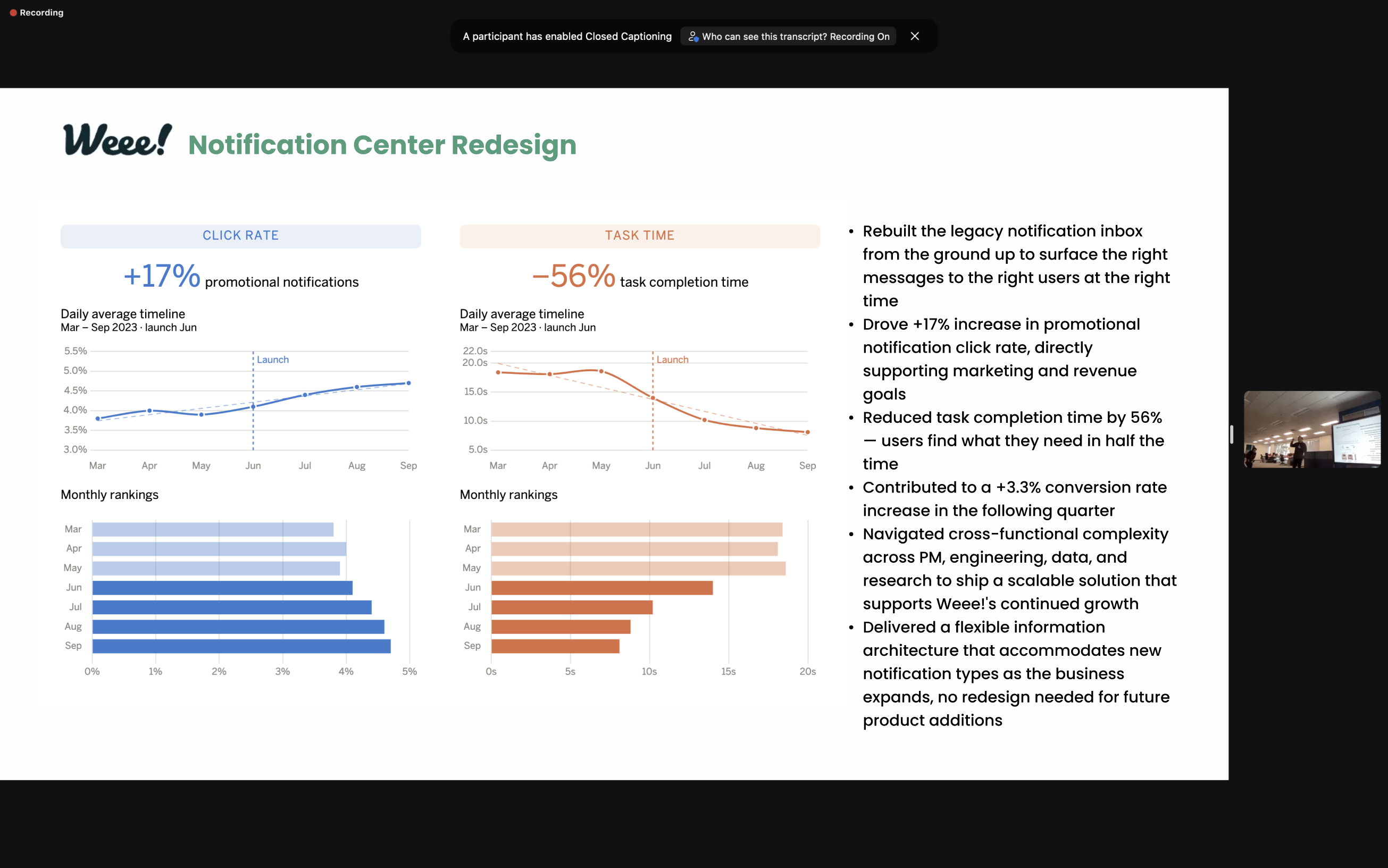
+17%
Increase in promotional notification click rate
56%
Reduction in task completion time
+3.3%
Increase in conversion rate the following quarter
About Weee!
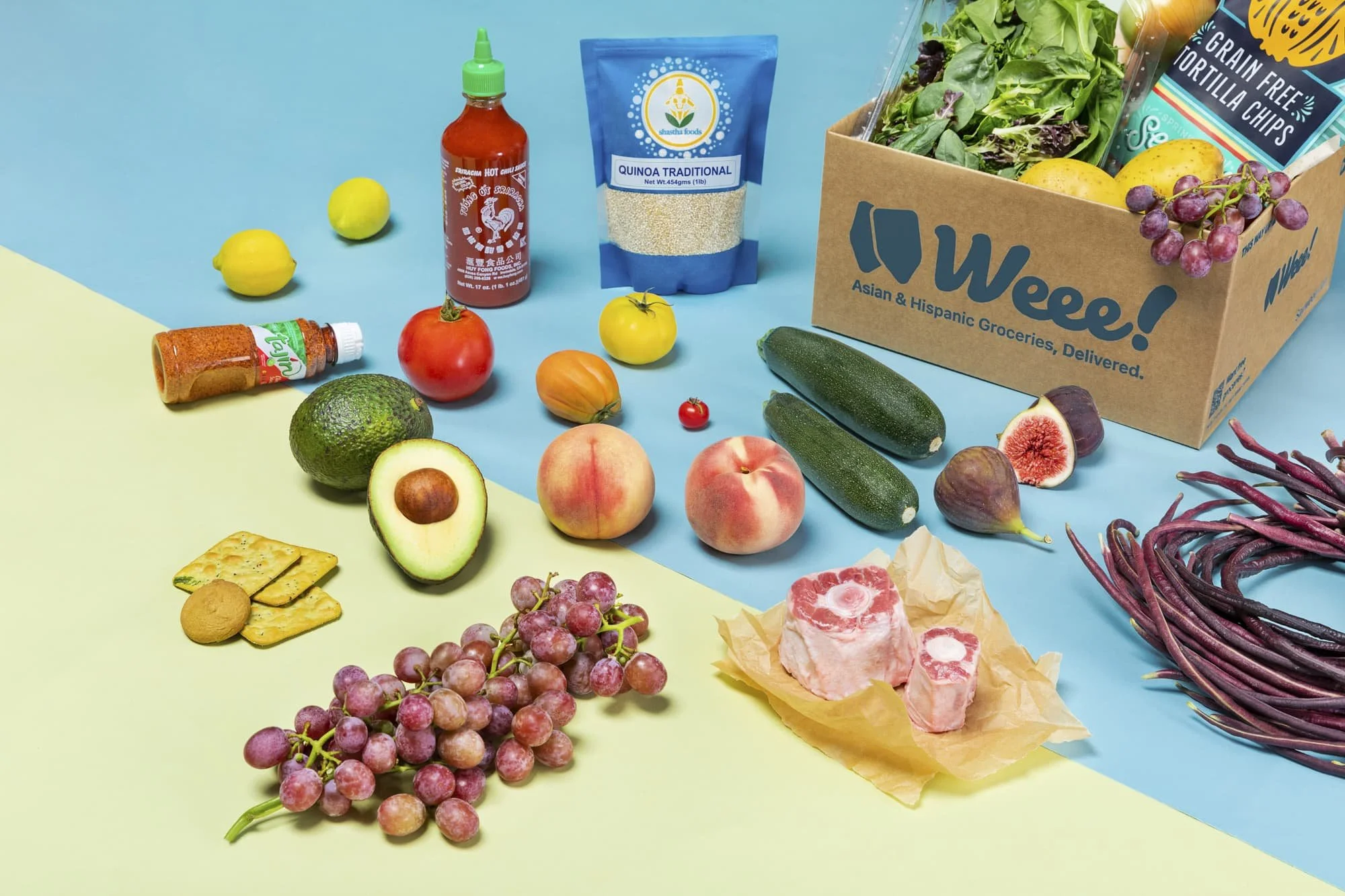
Weee! is the leading Asian e-grocer in the U.S., delivering more than 10,000 locally sourced grocery and marketplace goods from around the globe directly to more than 300K monthly active buyers.
01 — PROBLEM & SOLUTION
Key messages unsurfaced in the current inbox
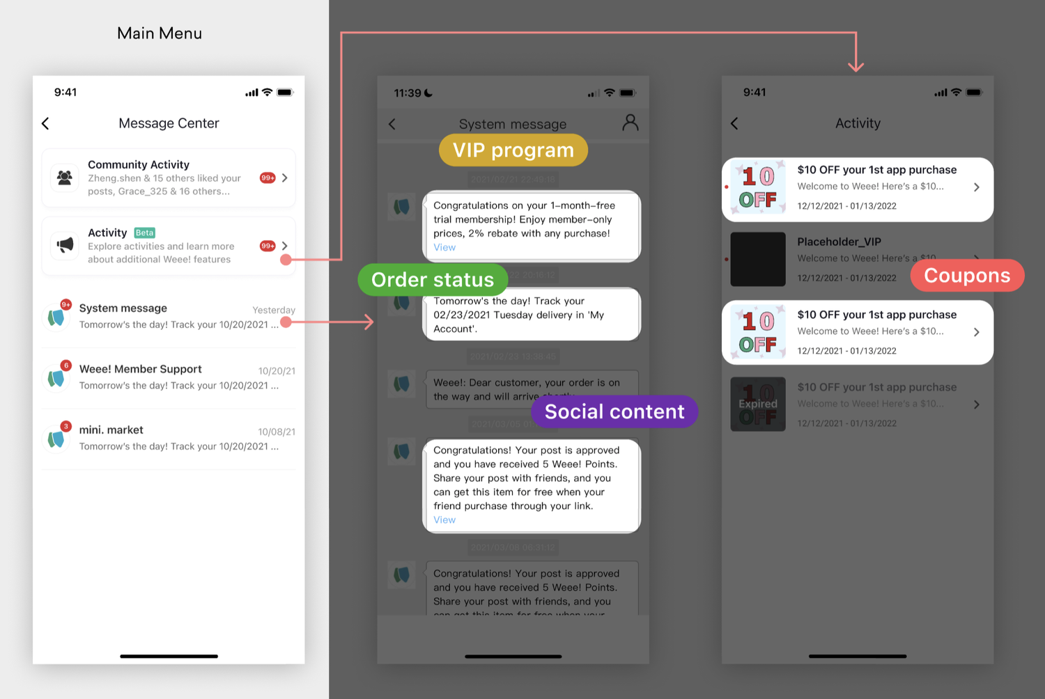
As Weee! expands its business horizon, the newly built marketplace services and marketing programs started to generate new types of notifications that won’t fit into the existing message center structure.
In the previous version, many types of important messages, such as coupons, refunds, and order status messages were not surfacing on the main menu.
Project goal
With a continuously evolving business strategy, we needed a solution that could:
- Surface messages that users care about. (Desirability — users need)
- Inspire users to spend more. (Viability — business need)
- Stay scalable and flexible to accommodate aggressive plans for growth. (Feasibility — technical requirement)
Final design
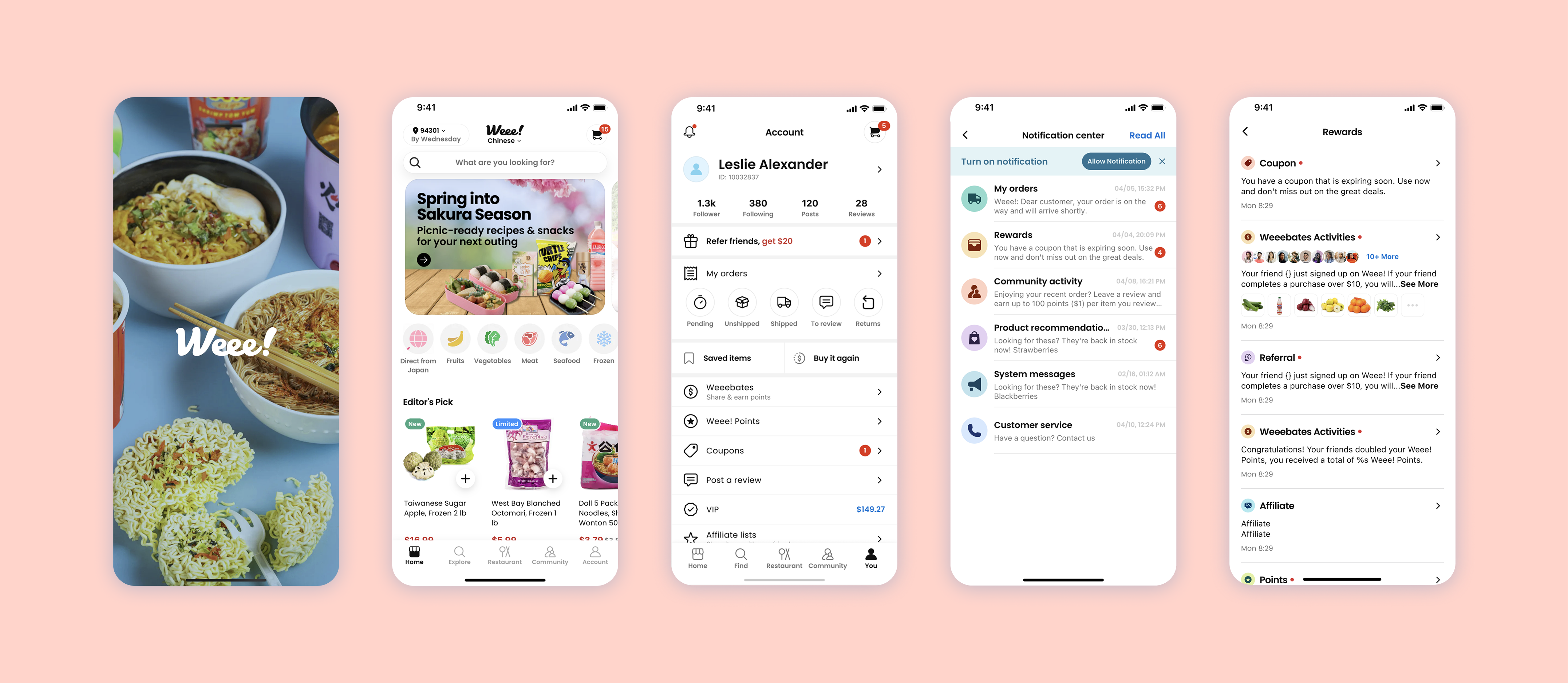
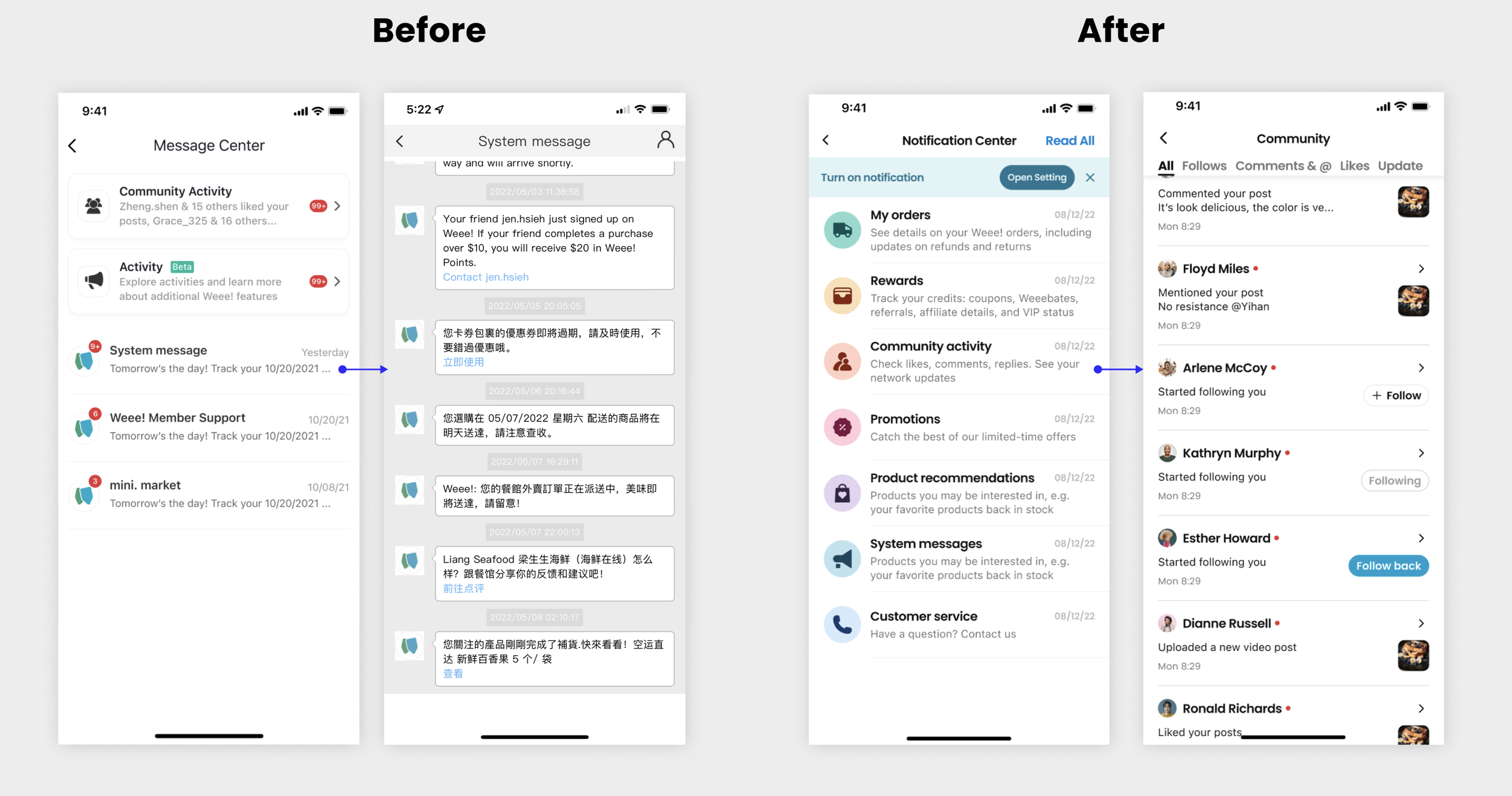
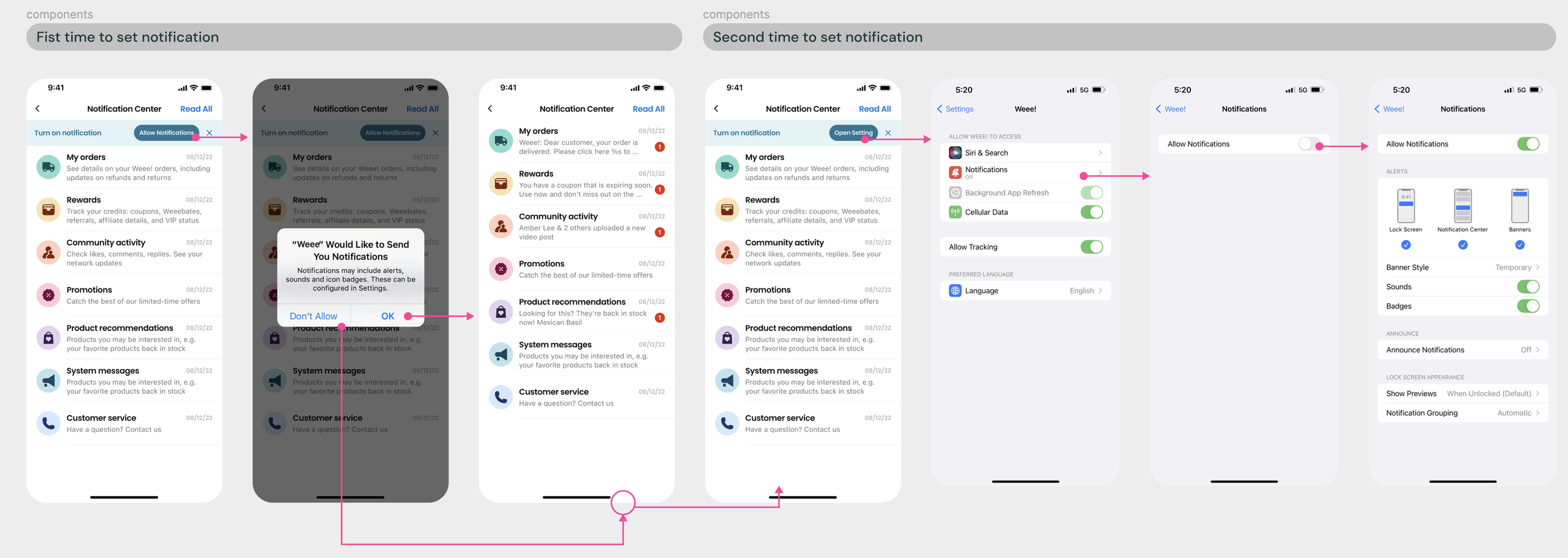
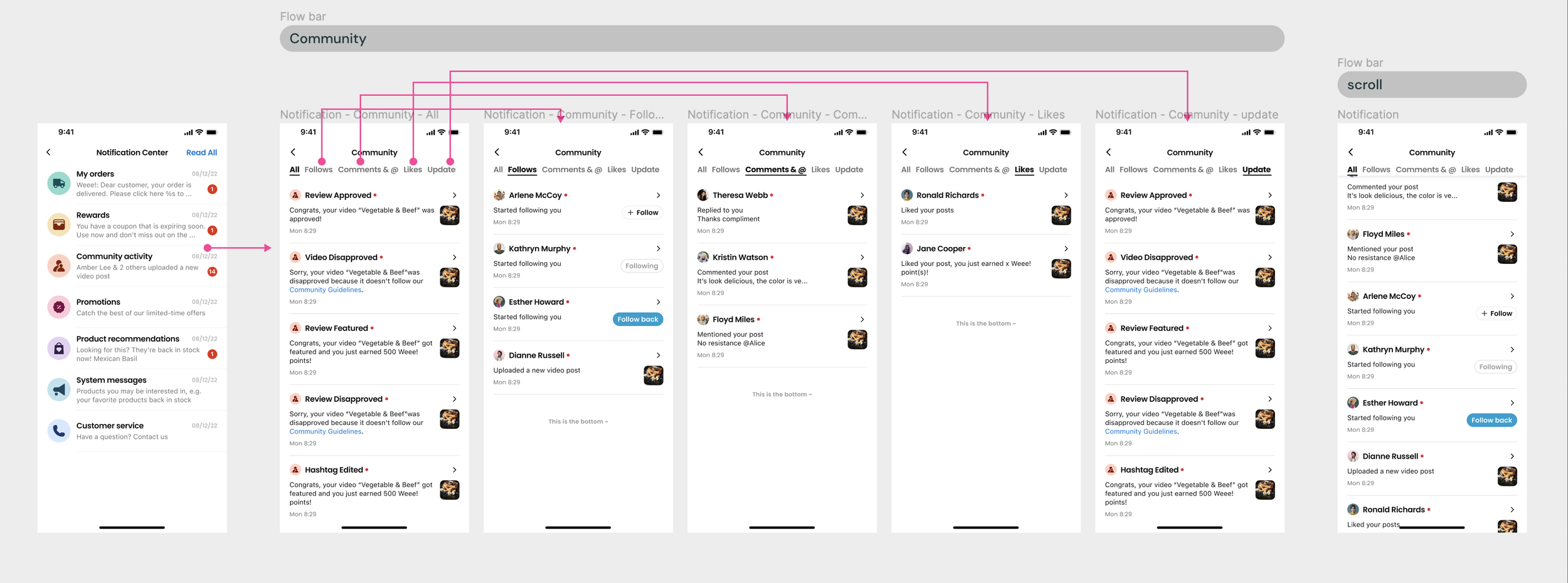
Now, users can easily be navigated to their most-cared message type, from order information, rewards, to promotions notifications. Other than the information architecture, the UI and information hierarchy are also significantly improved.
02 — CHALLENGE
Balancing desirability, viability, & feasibility
My PM partner came to me at the beginning of this project with a clear design strategy ready for me to iterate. However, in the process of discovering users’ needs and technical constraints, I gradually built confidence in a different design strategy to better balance desirability, viability, and feasibility for this problem space.
So I was challenged to facilitate more frequent cross-functional team communications and to integrate a more user-centered and iterative process to build buy-in along the way.
03 — RESEARCH
Comparative analysis
As a business-driven product team, my PM partner envisioned this notification center as a marketing window to grab users’ attention by presenting personalized promotions or other messages more directly and immediately. So, I did my first round of research on notification center design on different social media platforms to learn how they are engaging users.
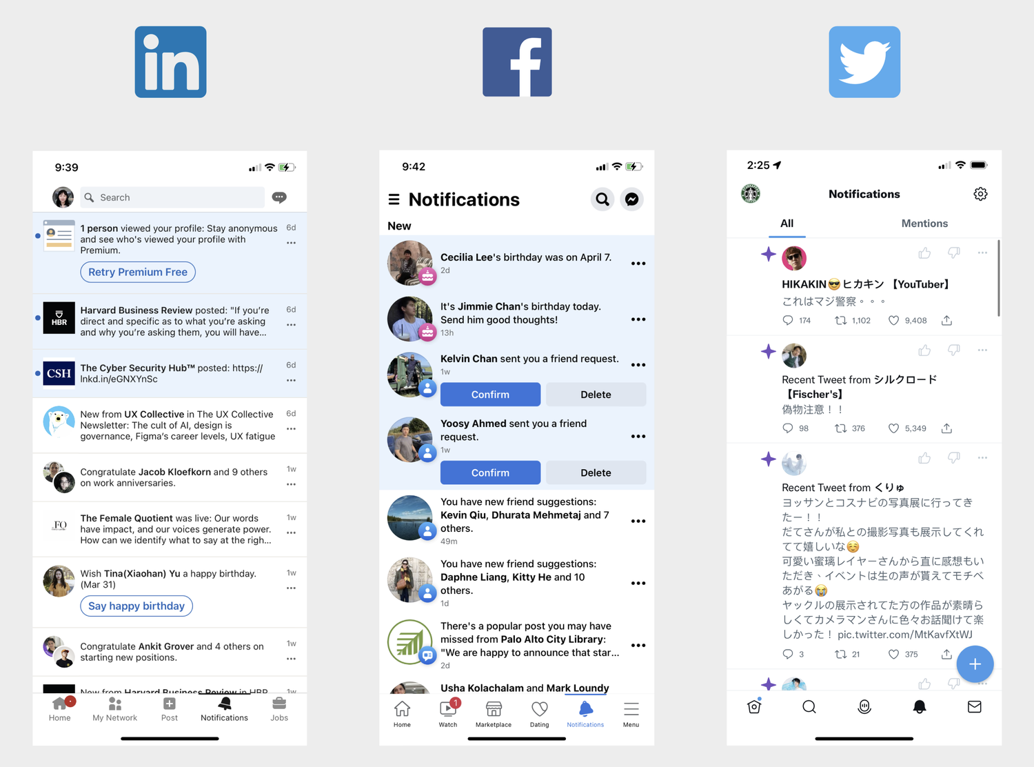
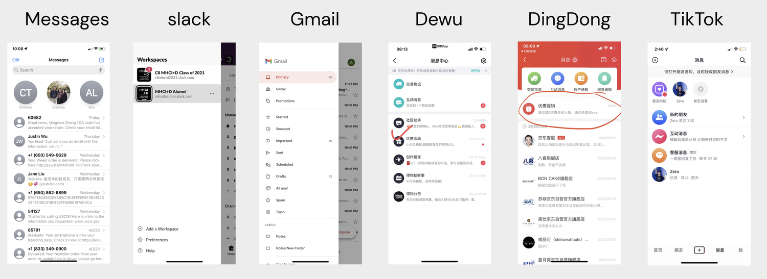
However, I think Weee! is more of a platform that offers services instead of a social media platform. So, I conducted another round of competitive research focusing on notification center design on diverse service apps.
User research
Meanwhile, we conducted usability tests on the current site to understand where customer pain points were in the existing flows. From users’ insights, I synthesized findings and developed a completely different design strategy.
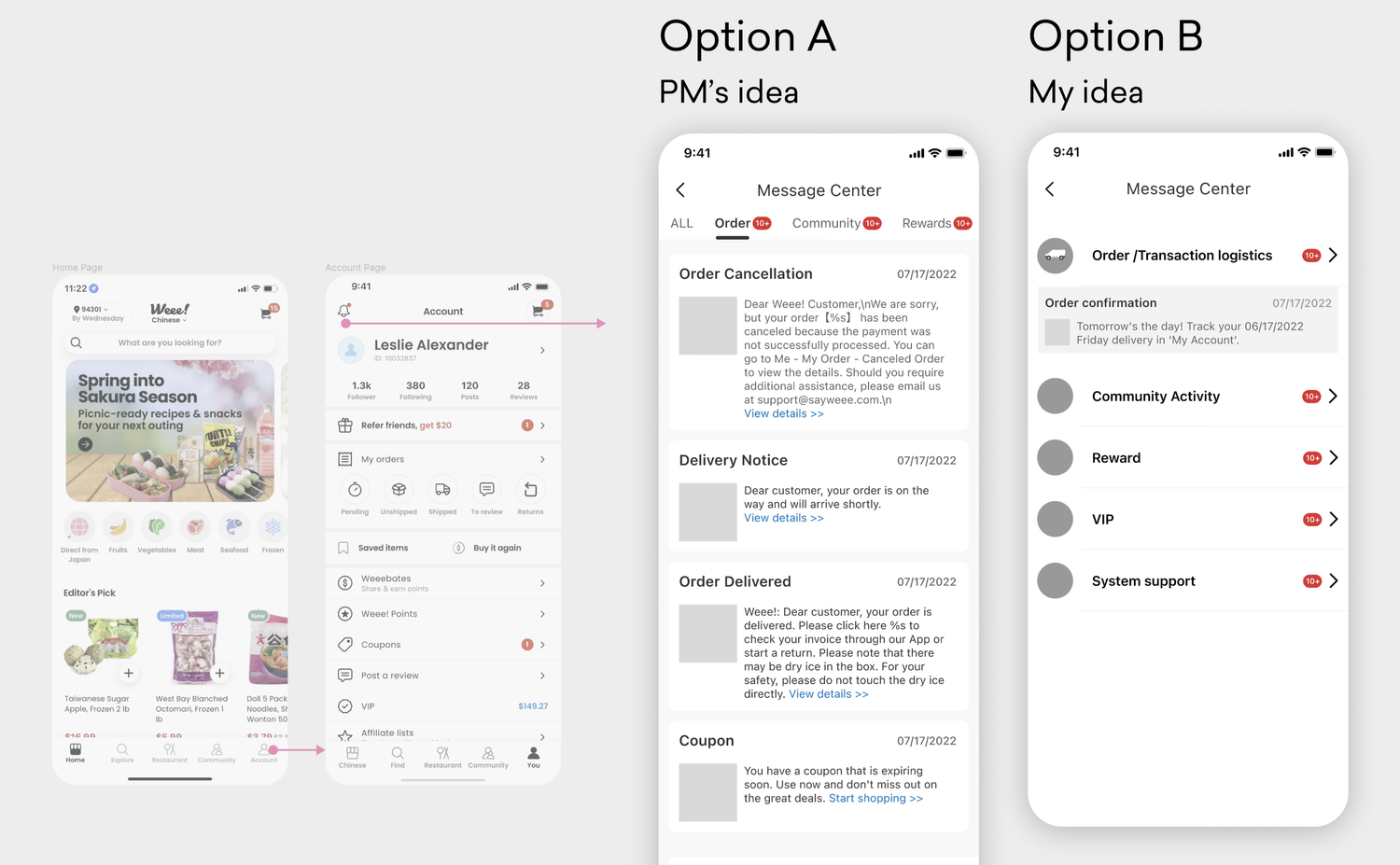
Option A / Option B
Based on the comparative analysis, I drafted option A, which presents more detailed messages that allow us to customize the prioritization of different messages based on user’s needs or business needs. I also provided option B, a list menu layout with clear and simple navigation, where we can still highlight a message for each category.
Then, I stepped back and conducted several internal and personal interviews to test two different design strategies before creating hi-fi mockups. Here is what I found:
Research insights
- The entrance of this notification center is very hidden to users.
- Users who prefer Option A appreciated the immediate exposure to the newest info. These users usually don’t have a lot of activities and loved to browse messages without a goal that needs to be achieved.
- Users who prefer Option B with a main menu were usually purpose-driven. So, they liked how option B provided a clear navigation.
Got buy-in with these insights
I translated those insights from both business and user perspectives to defend my design strategy.
- The location is too hidden to be a marketing tool. Since the entrance of the notification center cannot be changed in this project's scope, this feature would not be a good promotional tool. This means that those social media design references are less relevant in our case. So Option A is not optimal in this context.
- From a quantitative perspective, the majority of users come to the message center with a clear purpose. So all topped messages might be distracting to them. So, the user’s preference is Option B.
Information architecture
As we were still deciding between the two UX directions, it was more urgent to define the skeleton of our information architecture to inform the next design iteration process.
I worked with the engineering team to sort out all message types and then worked with my PM partner to identify how many and what those categories should be according to the user’s data analysis.
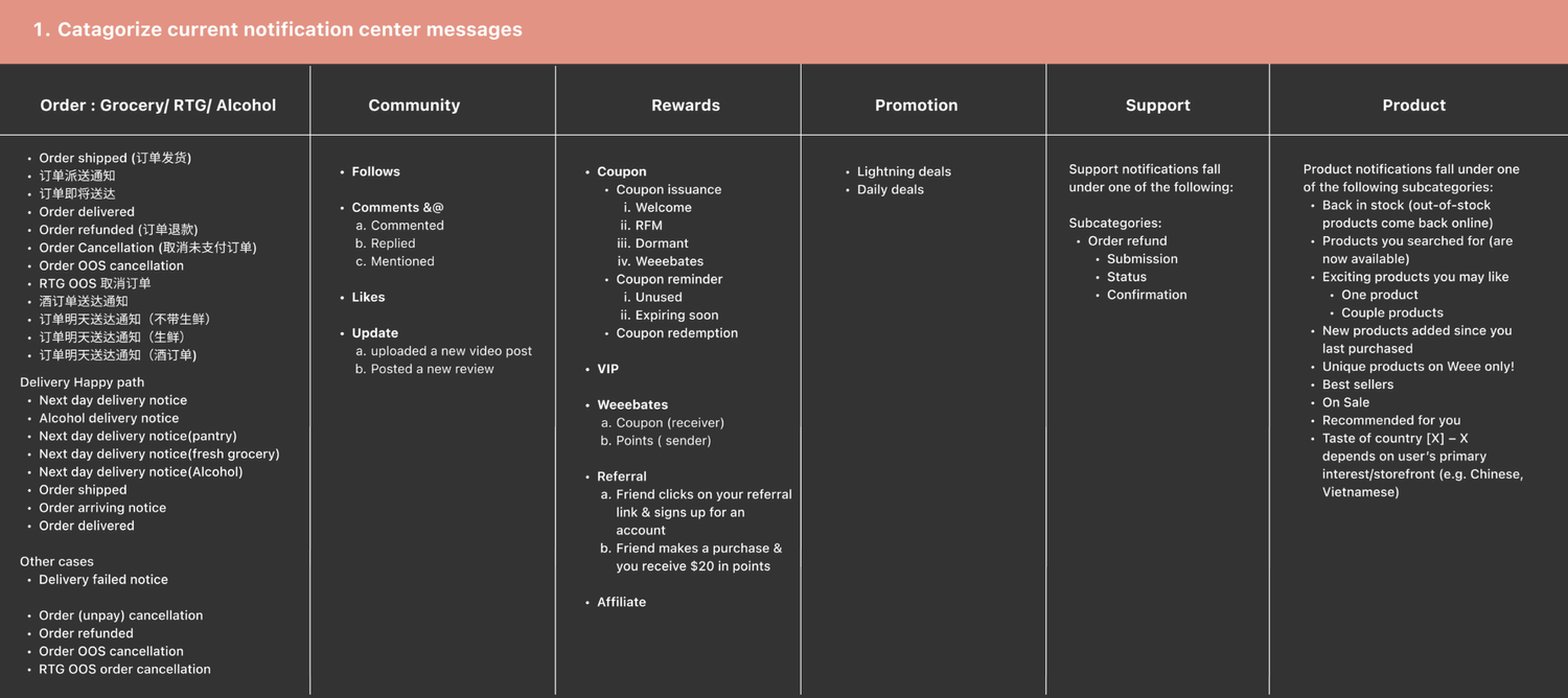
For example, the “my order” category is the first one, as we found out that most users headed straight to the order status when checking their inbox.
04 — DISAGREEMENT
Navigating a difference in direction
Circle back to the dividing UX direction, recognizing users’ need was not enough to resolve the disagreement from the business team.
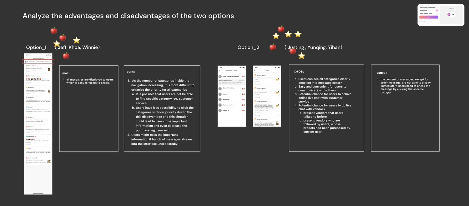
So, I conducted an internal stakeholder voting sessions with pros and cons listed out for two directions to learn more about concerns from each side.
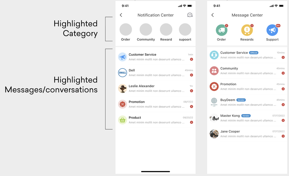
Middle ground
So, I iterated on a middle-ground design direction and tried to allow businesses to communicate marketing content more directly with users while navigating users to messages that are important to them. In this direction, I reserved the top section for frequent-used categories and allowed expanded messages to be highlighted with unlimited quantity.
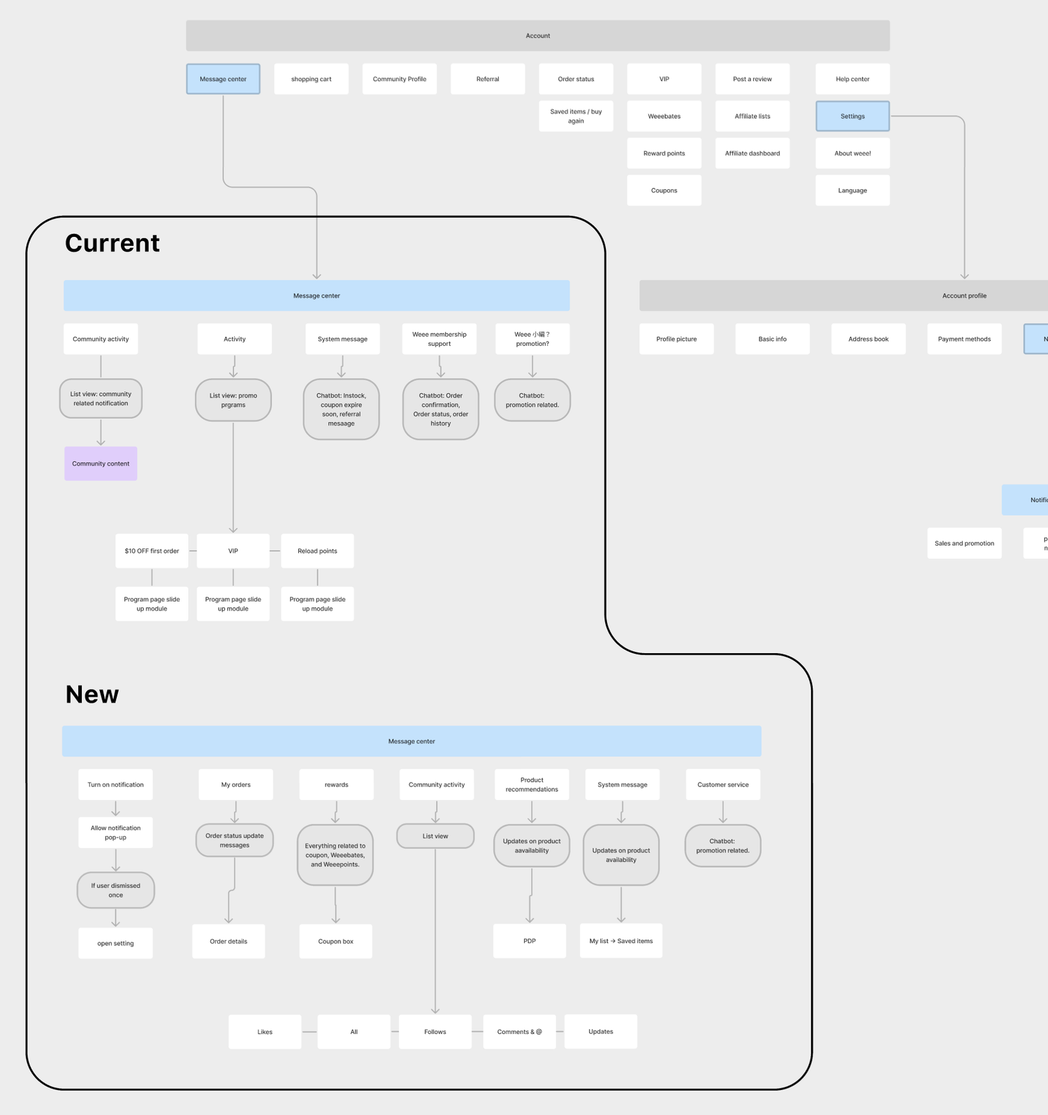
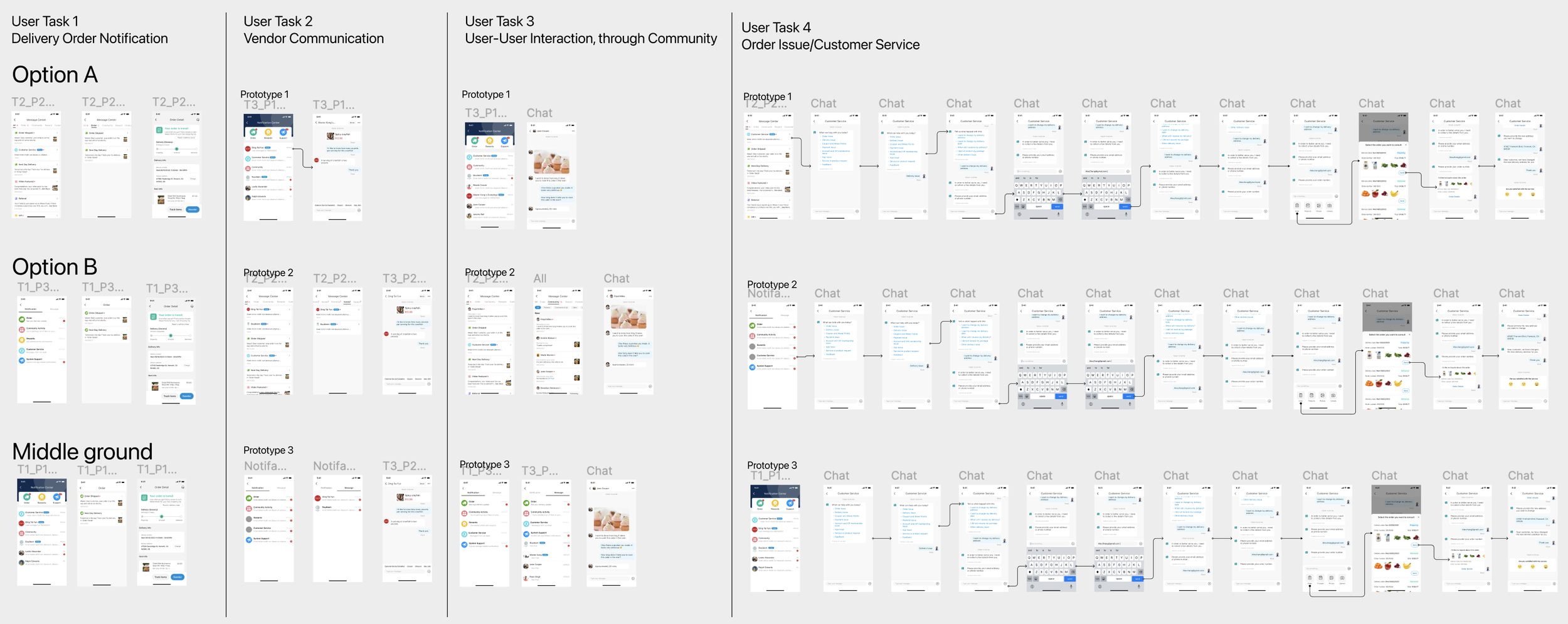
I also developed complete wire flows for each design direction to move on the discussion with the engineering team.
Turning point
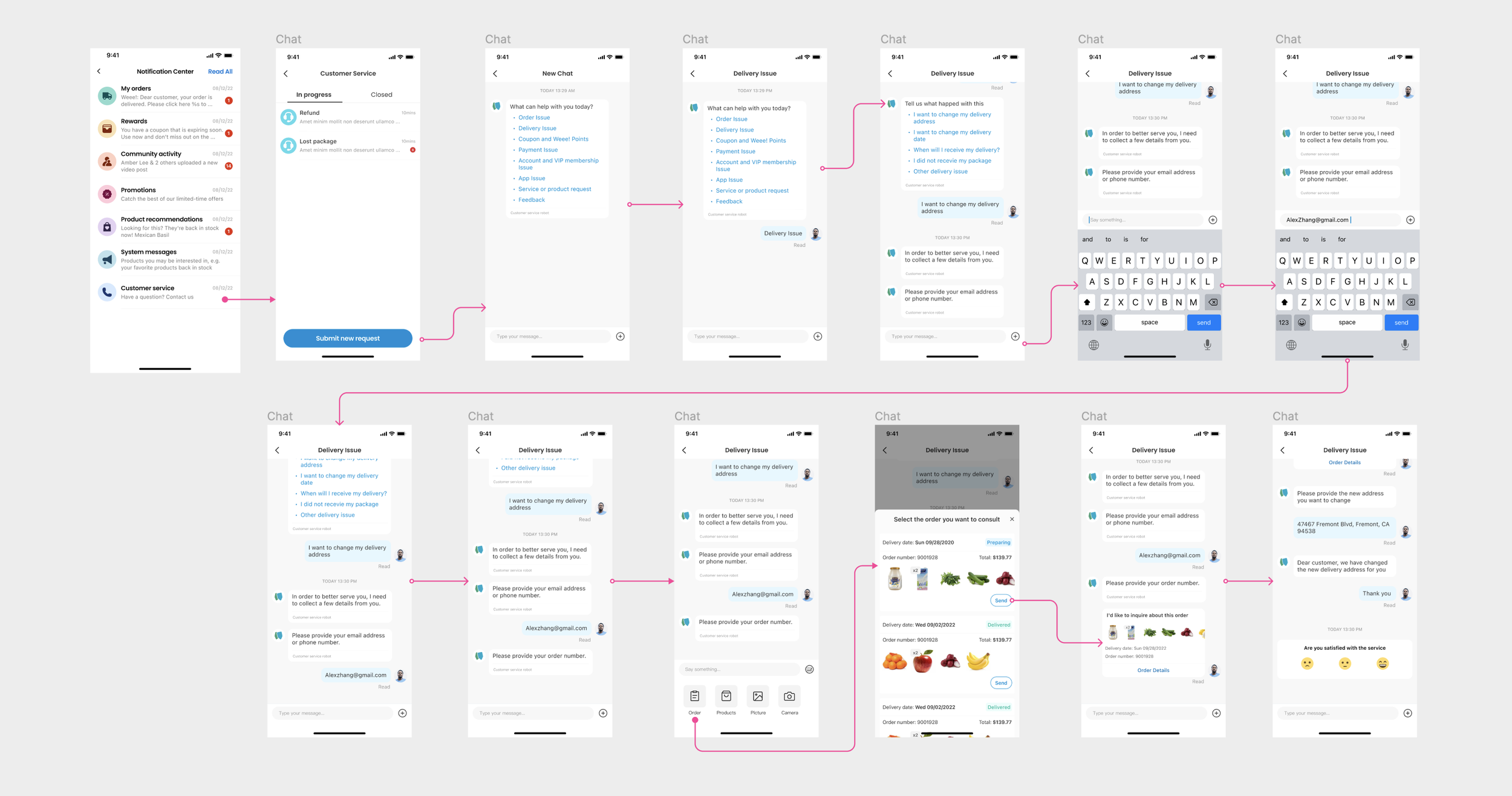
The turning point was when I found the potential scalability issues that my PM partner’s design strategy had as we will implement the customer service chat window in the next step. In order to visualize this issue, I iterated new flows for each design direction with logic and brought it to a bigger meeting with all stakeholders.
The feasibility of ranking in option A and the middle ground idea was a big disadvantage, considering its effectiveness as a promotional window. Meanwhile, option A and the middle ground idea also hurt usability as the majority of our users are purpose-driven.
After a long discussion about the pros and cons of the three directions, the whole team agreed that the complexity of option A and the middle ground idea would not fit its purpose and position in the app, and the structure is almost impossible to be scalable in the future when adding features like third-party vendor chat windows. So I successfully moved a more user-centered idea forward.
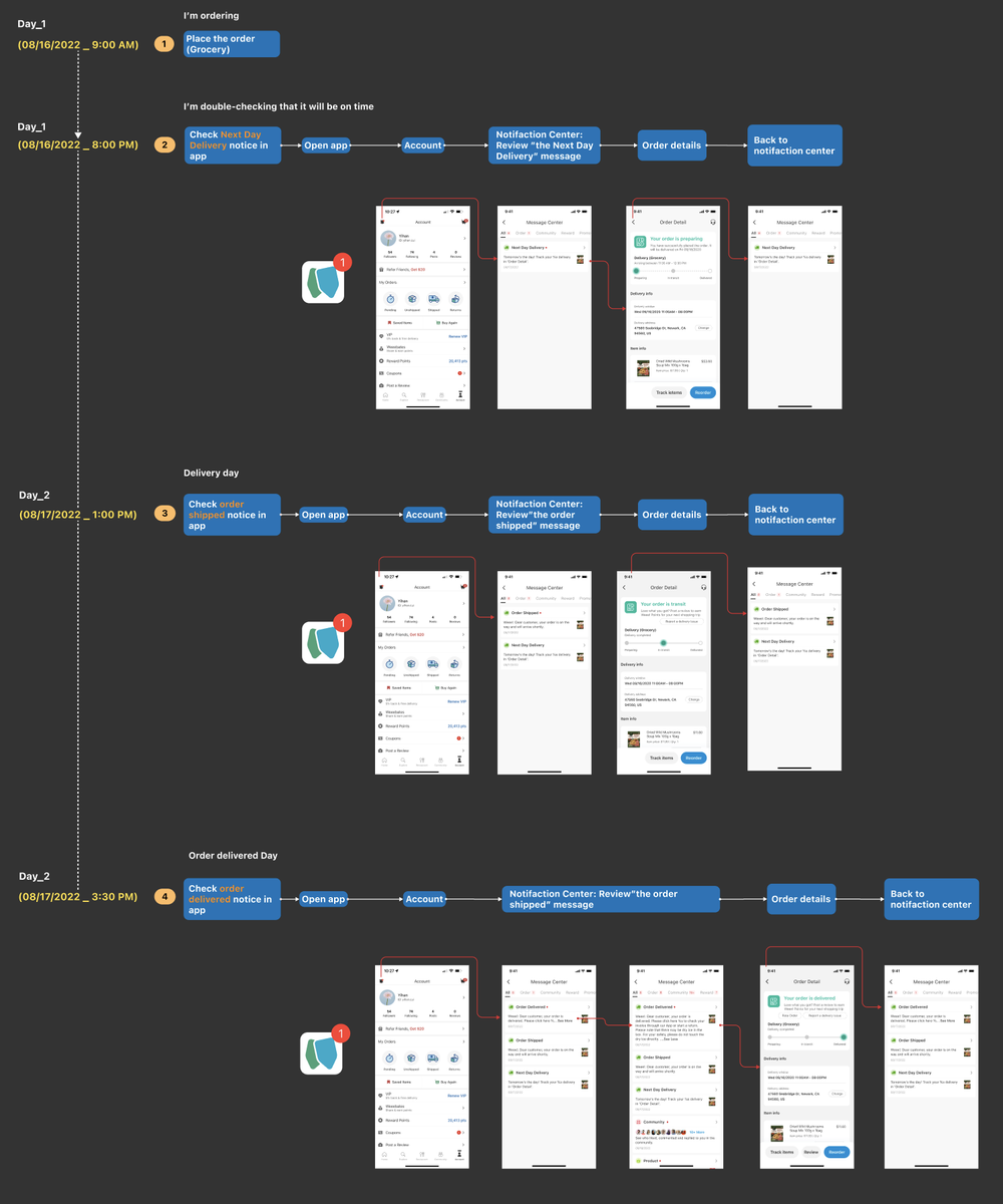
This is a logic flow of one use case according to my PM partner’s idea. I collaborated with engineers to created a complete set of logic flows for three directions to help the team evaluate the complexity and engineering effort needed for each idea.
05 — FINAL DESIGN
An arranged, more scalable inbox
The design direction I promoted was successfully rolled out and launched in early 2023.
We reduced the time users spent on this feature by 56% compared to the previous version, as measured by task completion time in a usability study. Which also contributed to the rise of 3.3% in the conversion rate.
Since we have customers who care about discounts and rewards, of course, we got a lot of positive feedback on this redesign project.
Notification center home
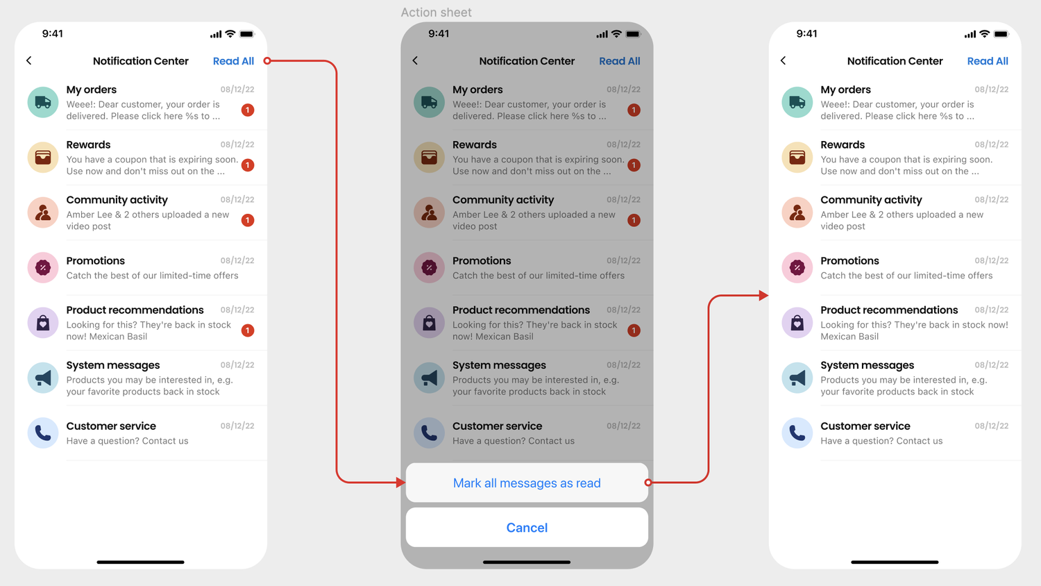
"Read All" flow
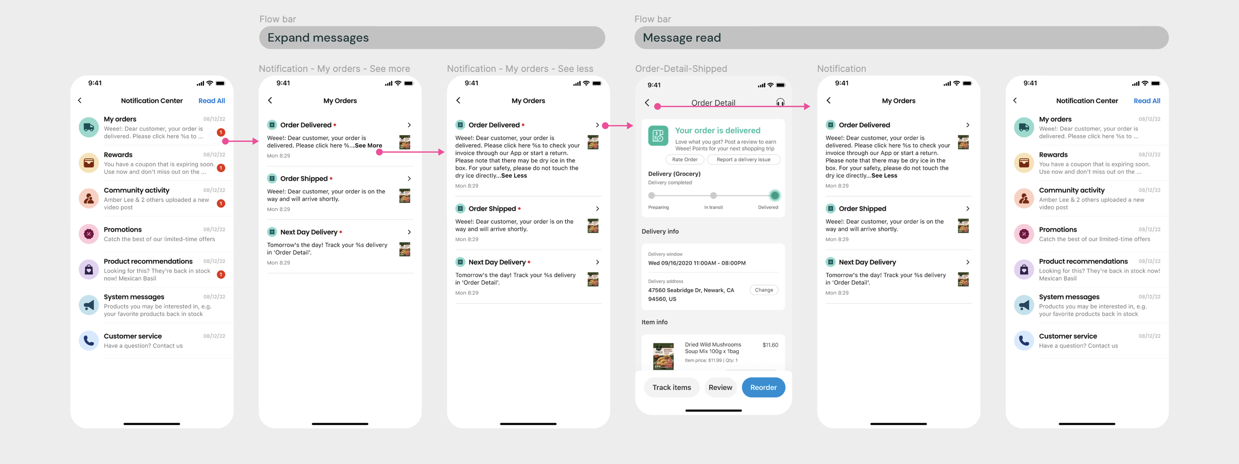
Checking My Orders flow
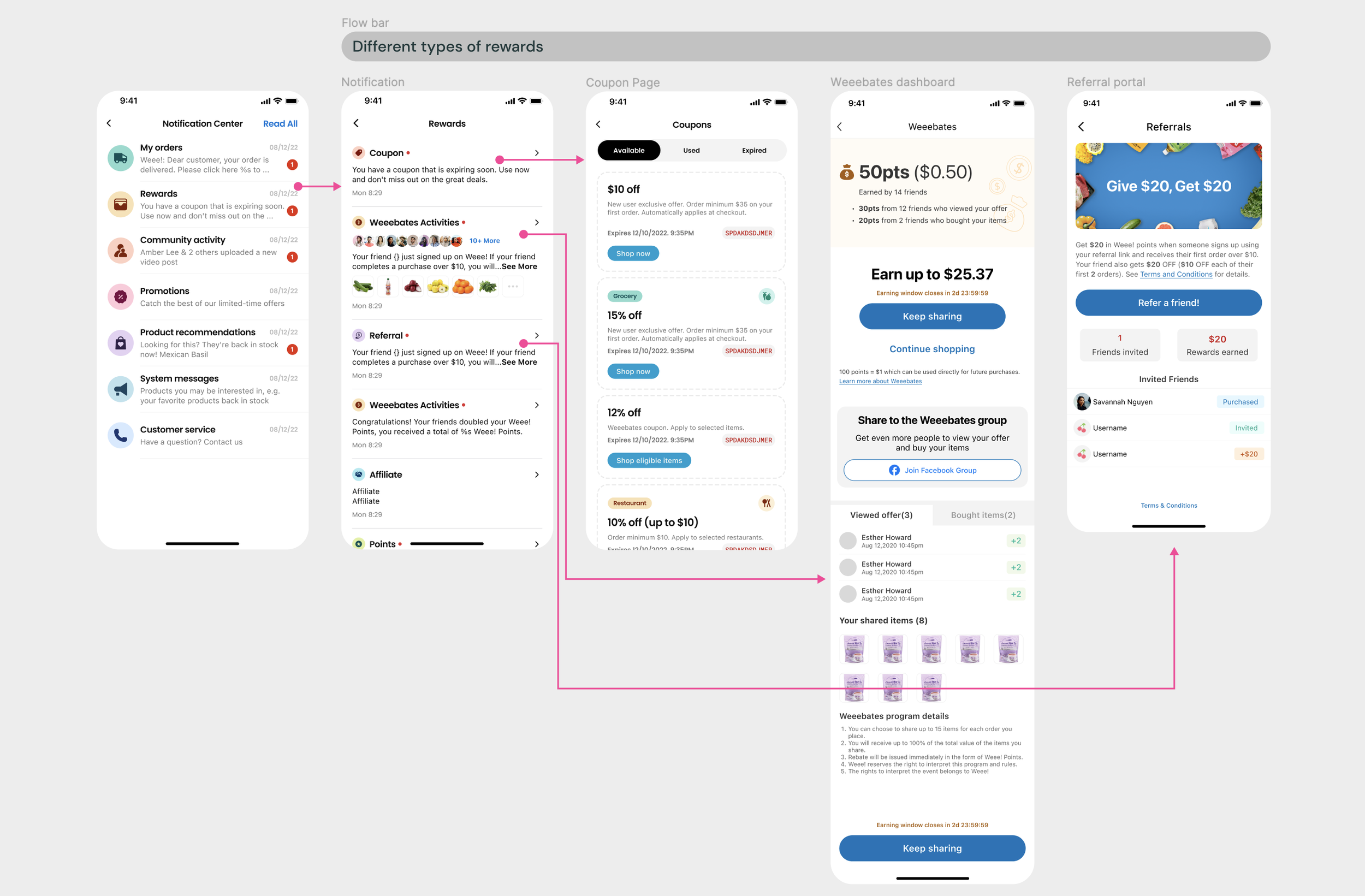
Rewards flow
Community flow
Next step: Customer service & other messages
06 — REFLECTION
Align the design priority with future vision
When developing a big feature with no resources to conduct A/B tests, it might be helpful to bring up the next step to guide the design process. In this case, the future vision was clear enough for me to work backward to guide my design decision. So, in the process of navigating the ambiguity, I was challenged to create more artifacts to translate the context of the future goal into detailed user flows to compare between 2-3 options, and then promote the most feasible and user-centered design solution.