CASE STUDY — 2020
Energy Monitoring App
Designing a mobile experience that turns raw energy-usage data into clear, actionable insights.
- ROLE
- Product Designer
- TIMELINE
- 3 months (2020)
- TEAM
- 1 PM
- 1 Engineer
- 1 Hardware Partner
- IMPACT
- Contributed to a 21.6% increase in household user sales, elevating the perceived value of the entire monitoring service, unlocking a previously untapped residential user segment, and receiving strong positive feedback from end users post-launch.
About Energport
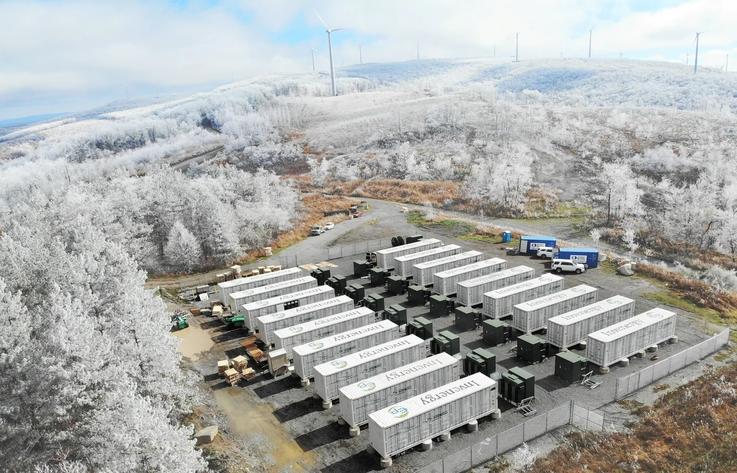
Energport is a leading supplier of integrated energy storage systems with commercial industrial, residential, and large-scale utility applications. The company provides both hardware and software systems for energy arbitrage, where energy is bought when the price rate is low and stored for later usage when price rates are highest.

About the Application: Emacs
Emacs is the software portal that connects to the energy storage system to enable users to monitor their devices in real time. Additionally, Emacs allows users to modify the configuration to maximize the device’s performance. It can also generate historical data for users’ references.
In conclusion, this is the only application that facilitates the conversation between the Energy Storage Unit and the end users.
01 — PROBLEM & SOLUTION
Too technical for the consumers it was built for
Four years after launching the basic device-monitoring application, the team began hearing consistent feedback about its usability, just as leadership was considering a pivot toward more consumer-facing products. This made the project a critical piece of their 5-year business roadmap.
To get a comprehensive understanding of the business goal, I conducted several contextual interviews with stakeholders in both marketing and product teams.
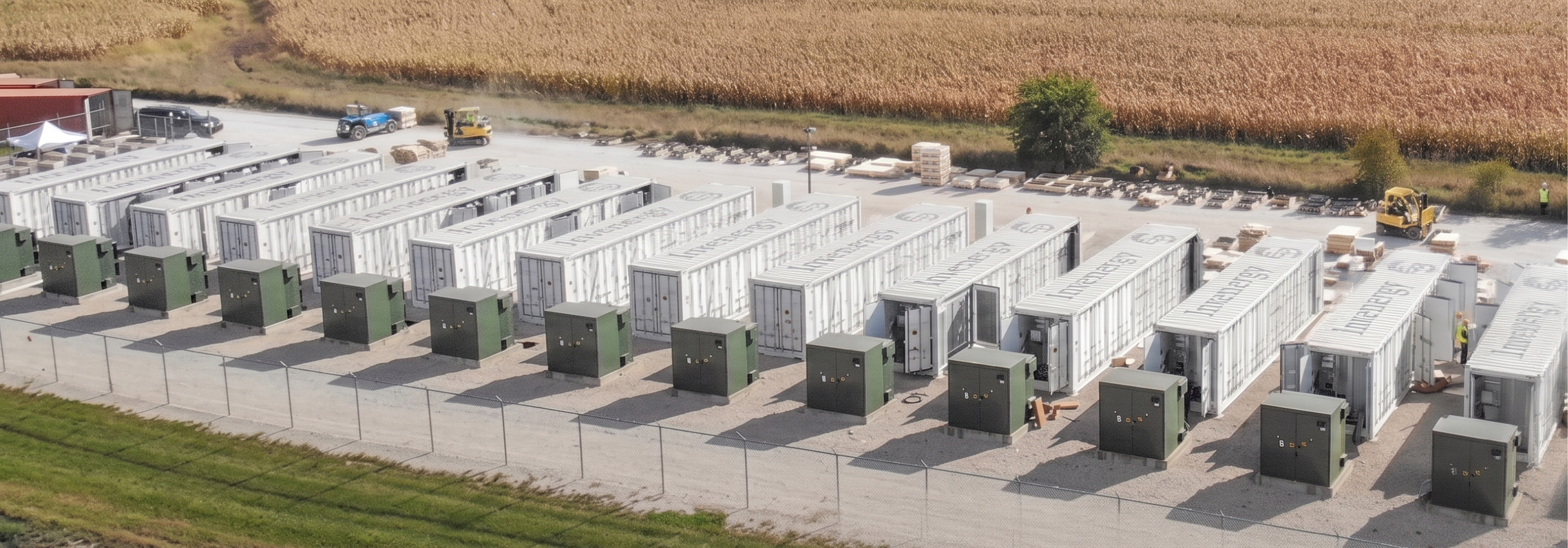
Main business goals

1. Increase demand for mobile application. Since most of the current users need to perform tasks with this web application in the field, which means that they need to carry around their laptops along with other heavy uniforms and tools, building a mobile application will be a significant improvement for the entire service.

2. Gain more residential customers. The company started its business by working with big corporations, and most of our users were technician contractors who had enough relevant experience to understand the complex interface. However, as we decided to gain more general users who have no technical background, the current application would be unusable to them.
Final Solution
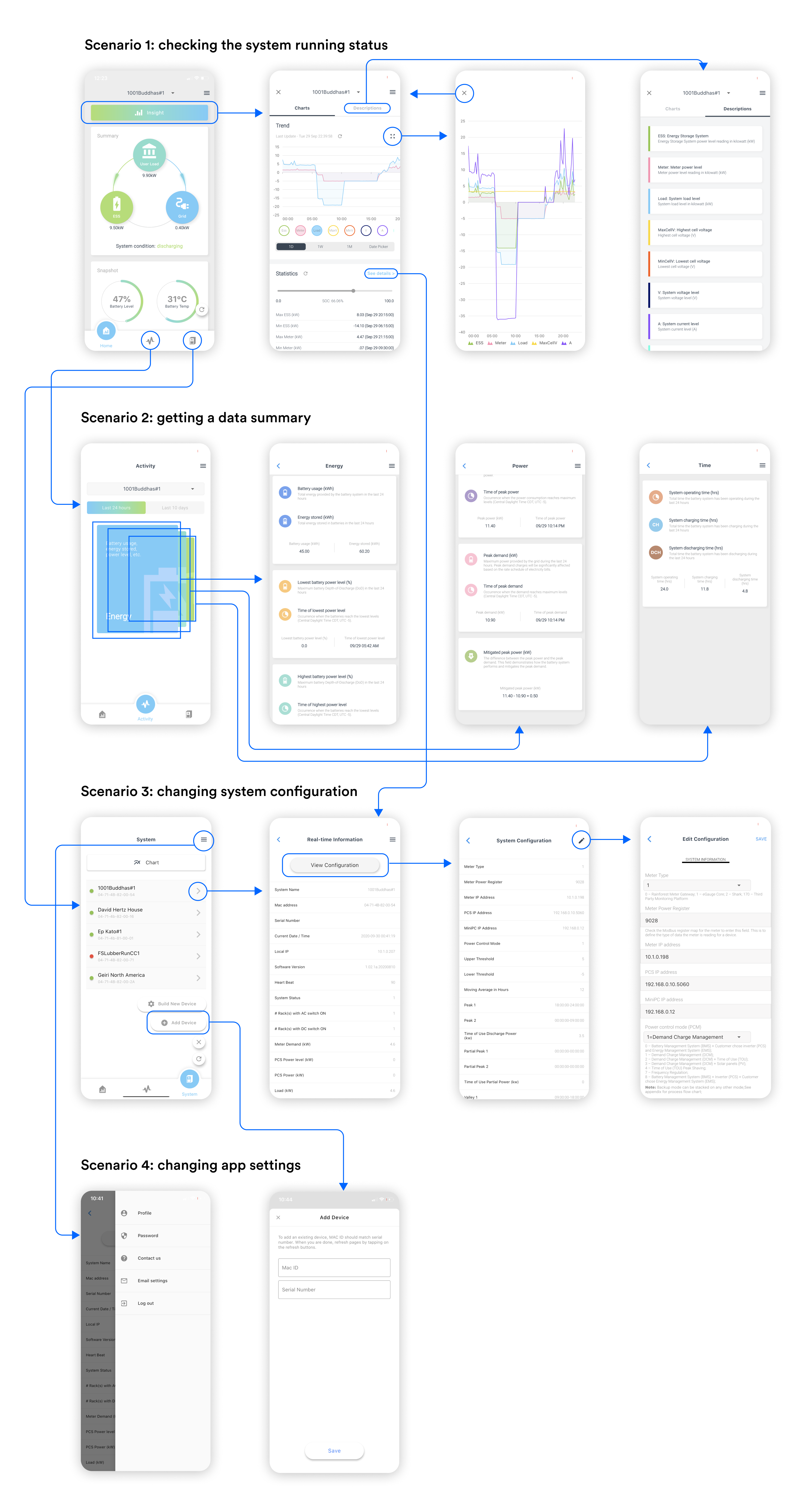
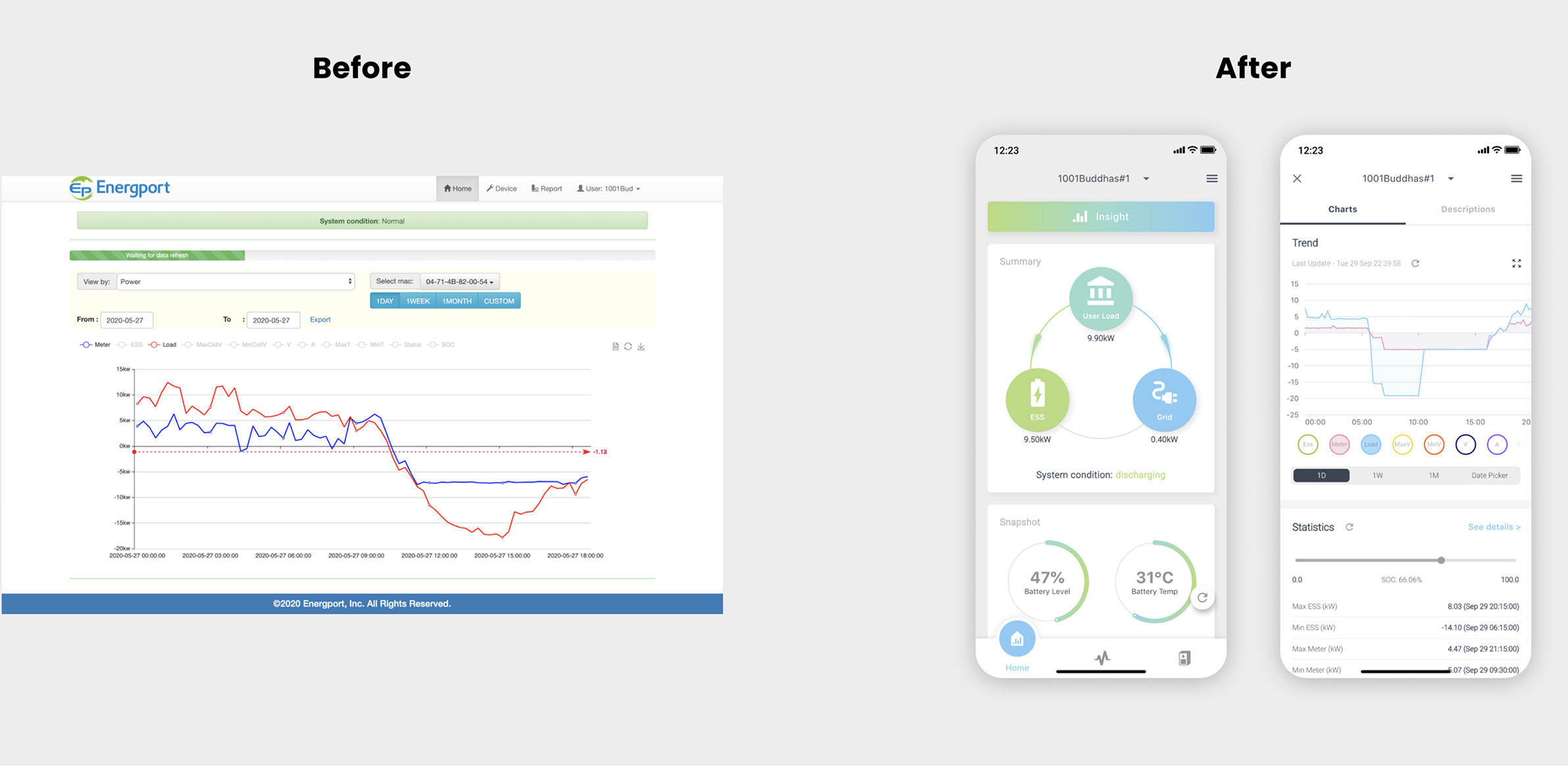
The final app supports both technicians and residential general users in easily monitoring performance and maintaining their energy storage systems:
- Digestible information density with more annotations and explanations.
- Improved visual hierarchy and navigation surface and explain the information users actually need.
- Stays scalable and lightweight to accommodate progressive data increases and device upgrades.
02 — USER RESEARCH
Learning from different user types
After aligning the business goals with cross-functional teams, I started user research to help me define the most effective design strategy to achieve business success. I used the following research methods to narrow down the design problem and understand who I was designing for, and what they needed.
Quantitative User Research:
- 130 Online survey: Conducted Google survey through several online giveaway events.
Qualitative User Research:
- 9 In-person interviews: Collaborated with marketing Specialists to reach out and schedule interviews with close related clients and potential residential users.
- 9 Usability testing: Conducted semi-structured usability tests during user interviews.
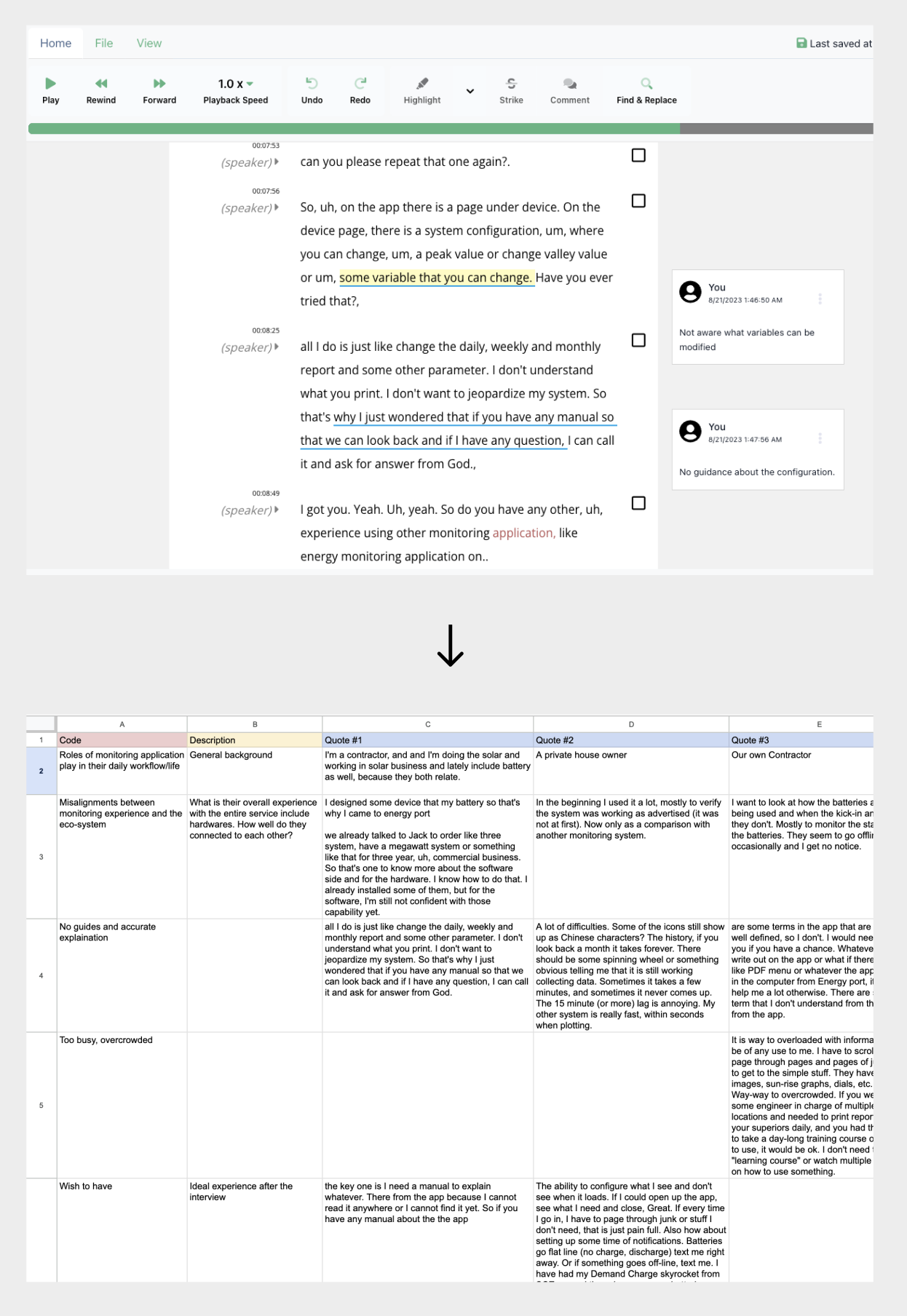
Synthesis Process
In the next step, I conjoined information across different participants to see the overlap. And then identify the user problem pattern from those overlaps to inform the iteration process.
After the synthesizing, I created two personas to visualize the two main types of our users. This helped the entire team to empathize with users and outline the design principles to avoid designing for ourselves.
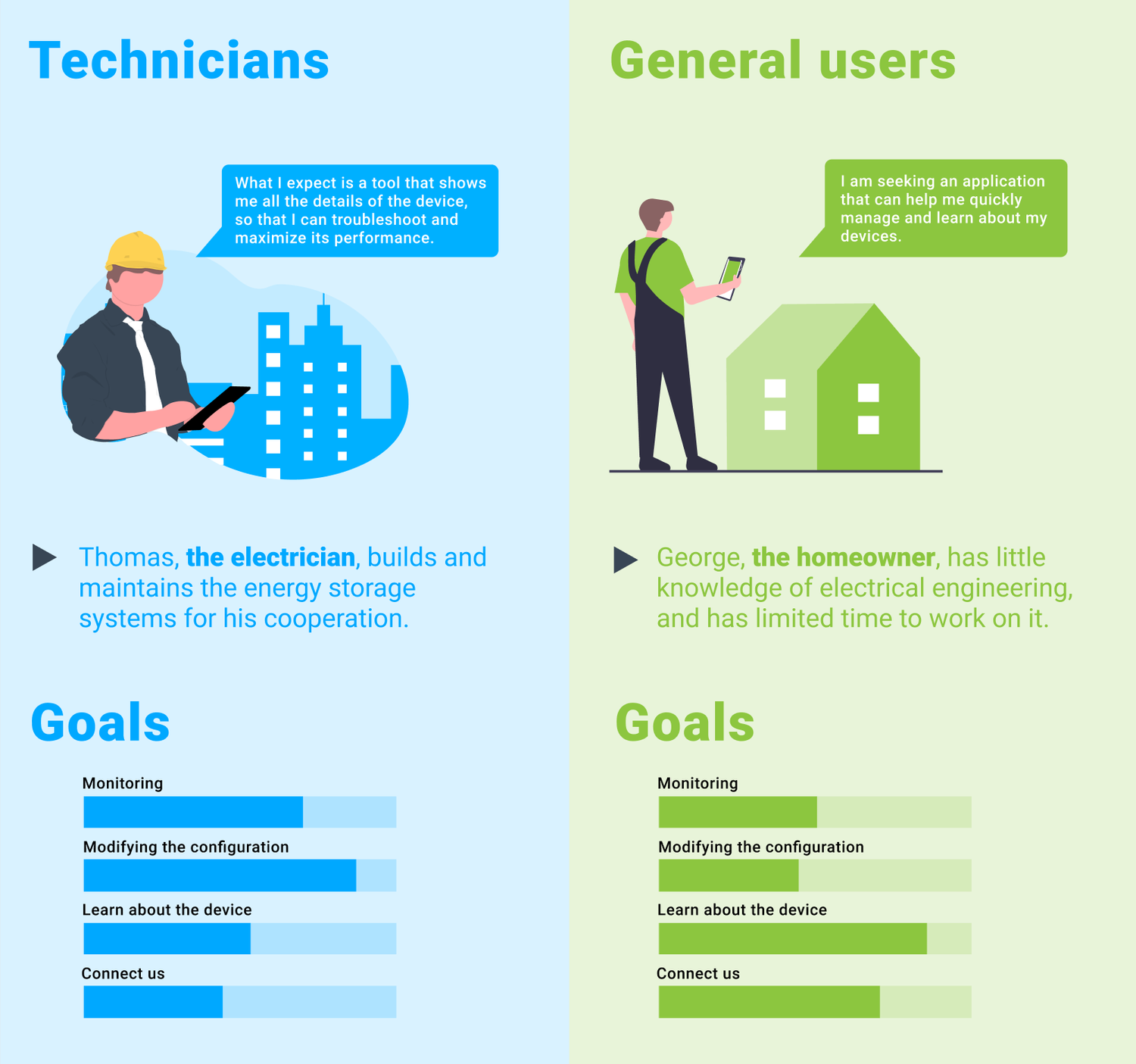
User Research Insights
1. Static Home page. Both general users and technicians were complaining about the never-changing status bar on the homepage. They wanted something responsive and constantly communicating with them to let them know their devices were still running.
2. Too technical to use. Nontechnical users had a hard time understanding the terminology and abbreviations everywhere, and they rarely explored any interactable elements, although they gave very insightful info to help users to learn about their system.
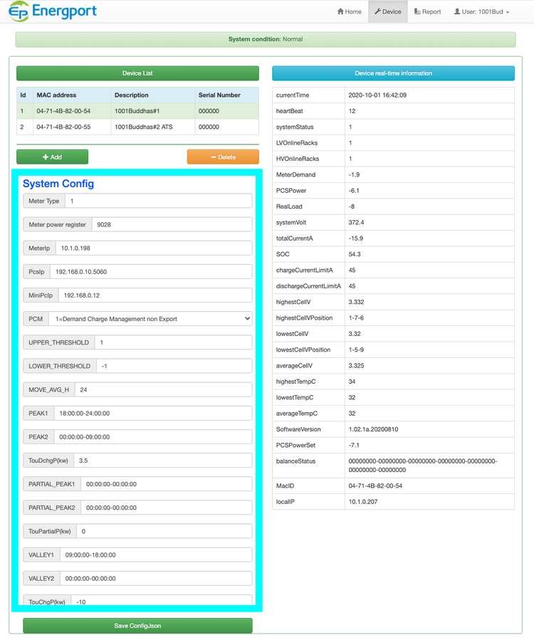
3. Guideless Forms. Without a lot of guides and navigations, many users have to use trial and error when filling out the form to modify the configuration. Sometimes, the wrong formated request may cause serious issues.
4. Data report. The raw data files mean nothing to residential users. Even technical users found it difficult to extract useful information on this application.
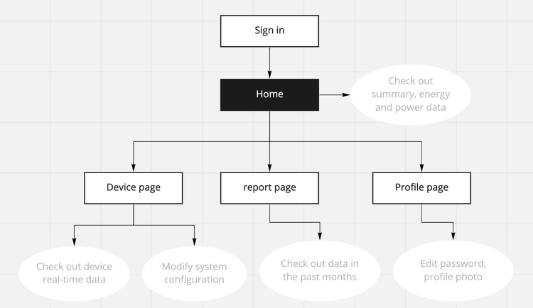
Redesign the Information Architecture
Stepped into transforming this web application to mobile devices, my PM and I took a closer look at the structure of our current information system.
The existing information hierarchy was too flat, surfacing too many infrequently used data and functionality. The user had to spend extra effort hunting insights and explanations. I did mainly these few things:
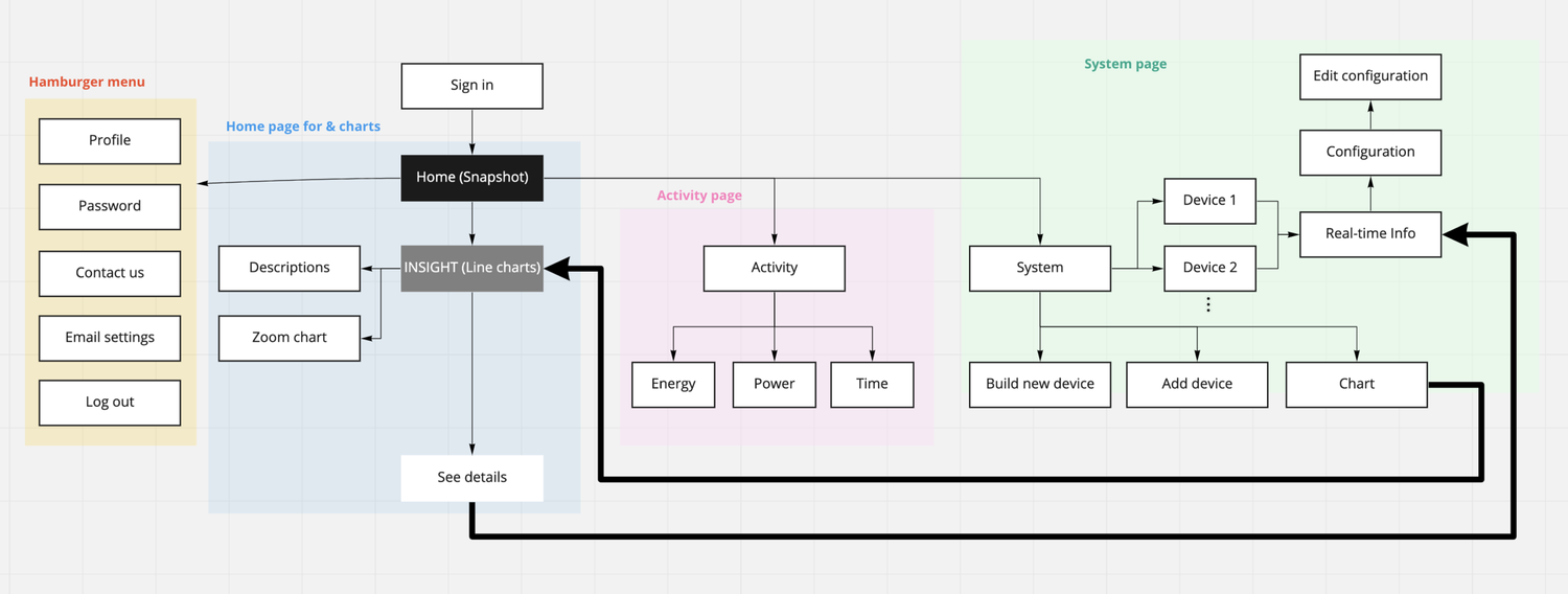
The New Information Architecture
- I divided up different categories of information and created a new information architecture that makes each section more digestible.
- Prioritized information based on persona. For example, both users wanted a more detailed status summary. This is why I decided to set the status summary as the homepage of the app.
- Reviewed the flow chart with our engineering team to ensure the stability and feasibility of this new information architecture.
03 — CHALLENGE #1 – HOME SCREEN
How to communicate device status in a more interactive and engaging way?
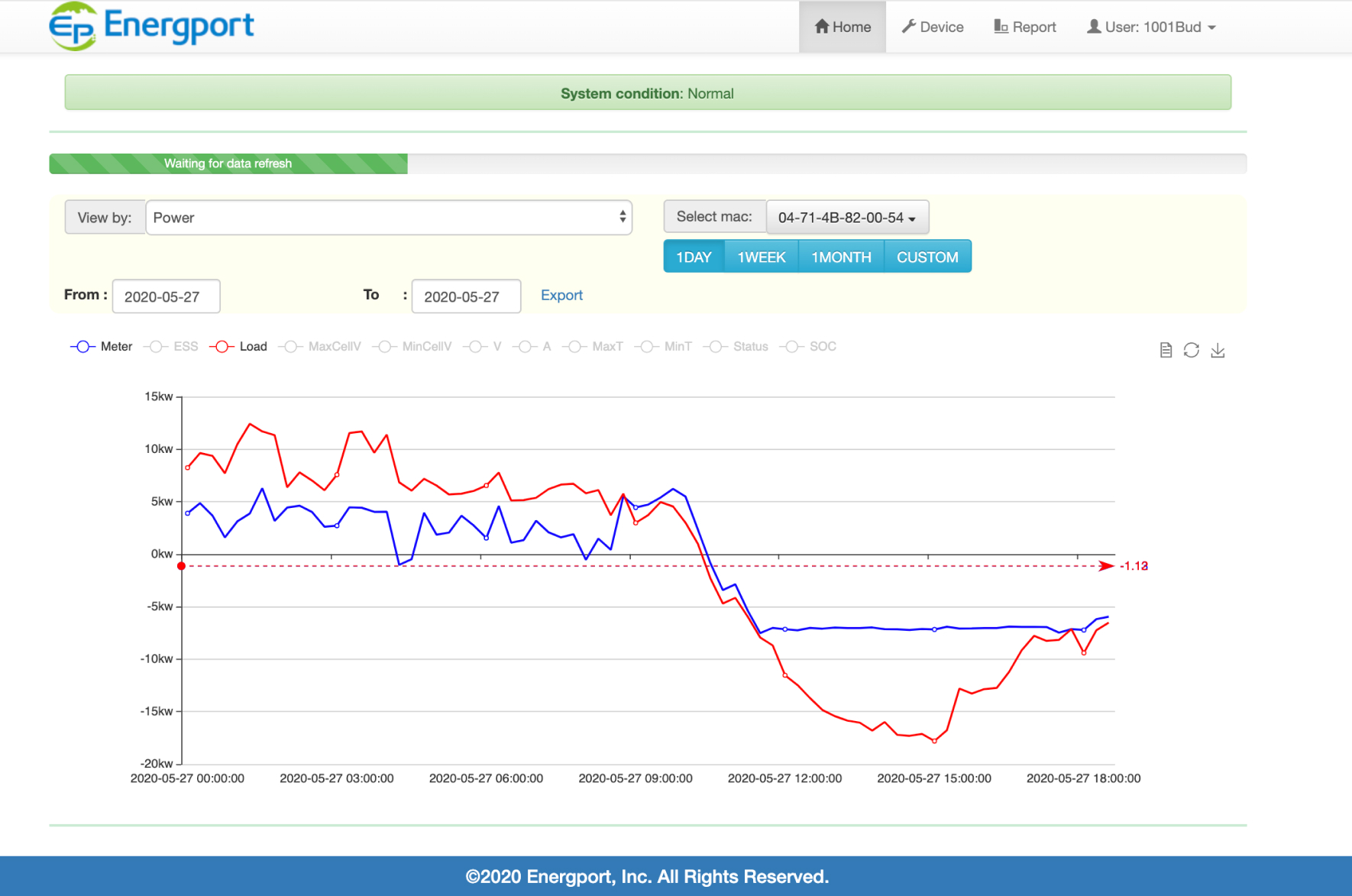
Based on the research, I found most general users can only see the status bar that shows “normal” or not. They totally missed the bigger picture of how three parts are working together in their energy storage ecosystem; other than the storage devices, there are also grid power and user load. Without checking the line diagram below the status bar, users won’t understand how the ESS device connects with grid power and user load. For this reason, we decided to enrich the status bar, and have the entire home page to place it as a detailed status explanation.
This design strategy was set to guide the iteration process for the home page redesign. Below are a few visual iteration playgrounds.
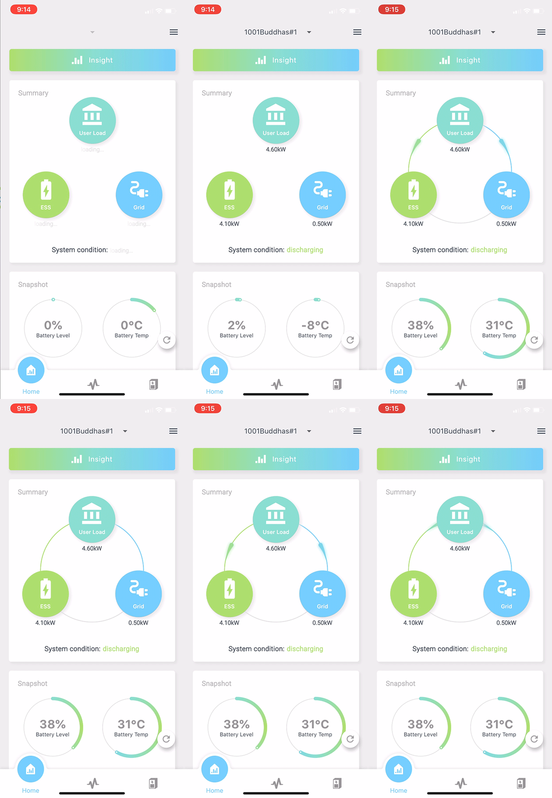
Solution: A Real-time Device Summary
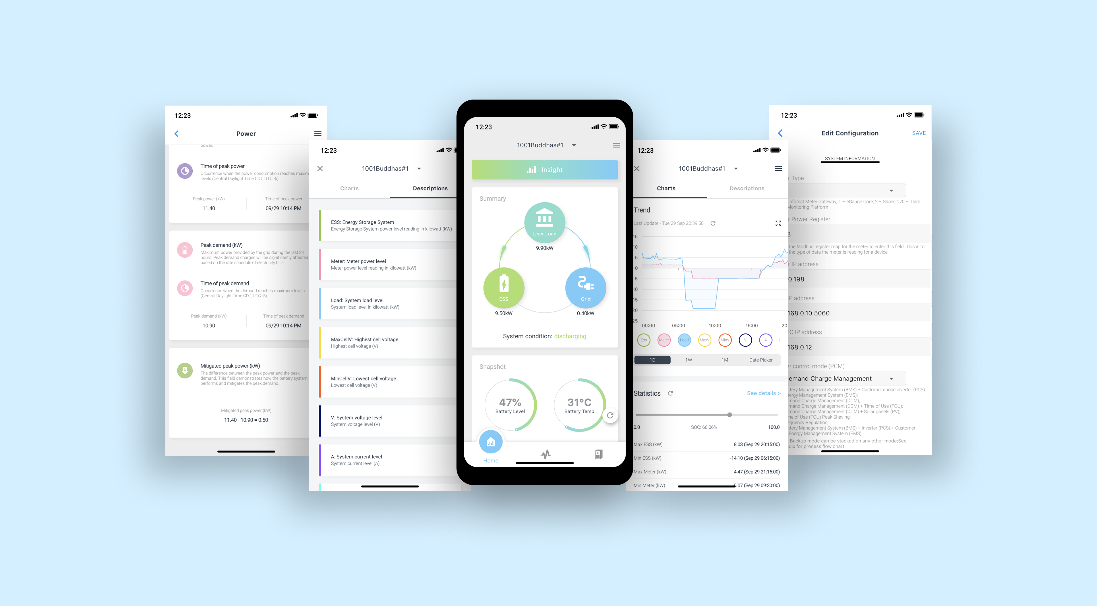
The new home screen embedded a motion graphic diagram that clearly presents the current charging direction that users cared about. In addition, there are two pie charts that summarize the current battery level and battery temperature.
According to our user survey, we decided to stick with the white version, which is easier for the eye, as our users were mostly using this app during the daytime.
04 — CHALLENGE #2 GRAPHS
How to make technical feature useful for general audiences?
From residential users’ feedback and my own experience using this app, I found the content on every page was too broken and too technical to be understood by general audiences.
Then, based on user research analysis, I narrowed the problem space down to three issues: First, when users select to show all values in the line chart, some values will fall into very different ranges, then another end of the diagram will get squeezed and become unreadable. Second, too many technical terms. Lastly, the interaction on this diagram lacks an easy way to provide the most desired diagram output.
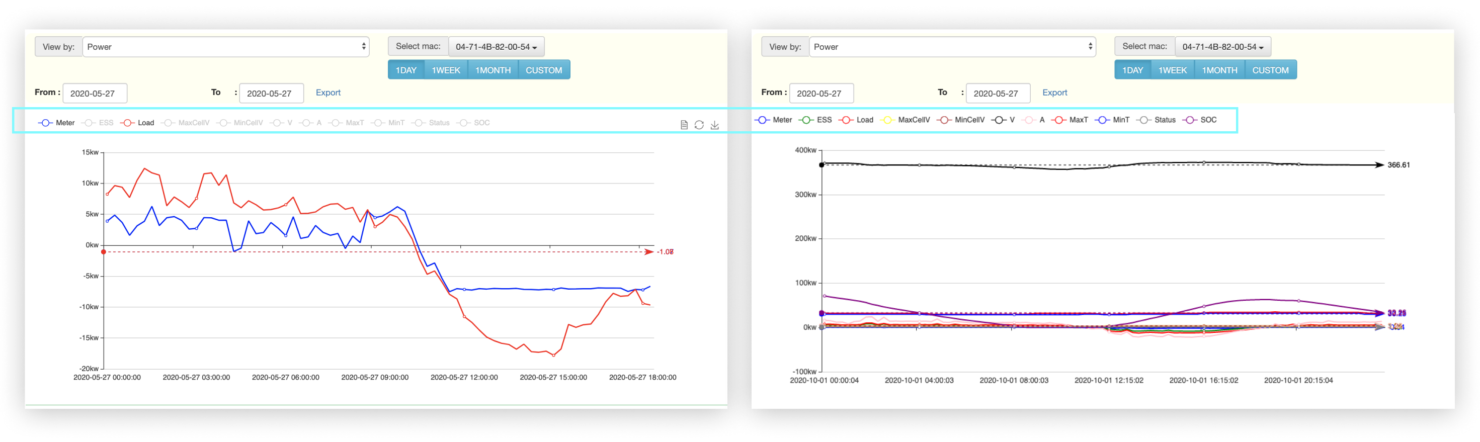
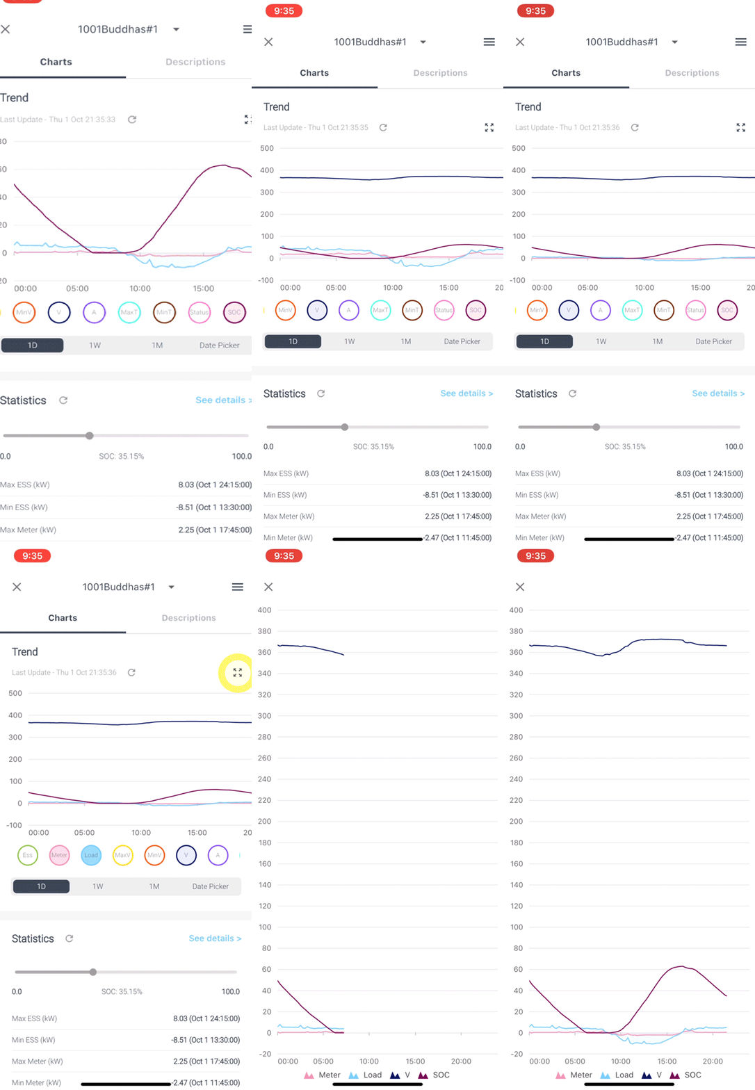
Solution: Zoomable Diagram
Then, I translate these users’ problems into three design strategies:
- To make the main line diagram readable
- To give annotations for all the terms and abbreviations
- Simplify the experience of interacting with the diagram
Users can now zoom up the diagram by opening up a separate window to display a larger diagram that better describes the system running status.
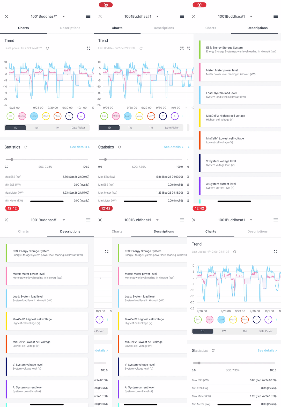
Solution: Informative Contextual Tab
A description tab for users to check out a brief definition of each term.
We also added a few quick time range tabs instead of a date range field that previously requires manual inputs.
05 — CHALLENGE #3 — GUIDELESS FORMS
How to navigate users to modify configuration?
In the previous version, there were no filling instructions and guidance to navigate users through this lengthy form. Moreover, this form may cause serious issues and financial loss with inappropriate modifications.
Solution: A Guided Form
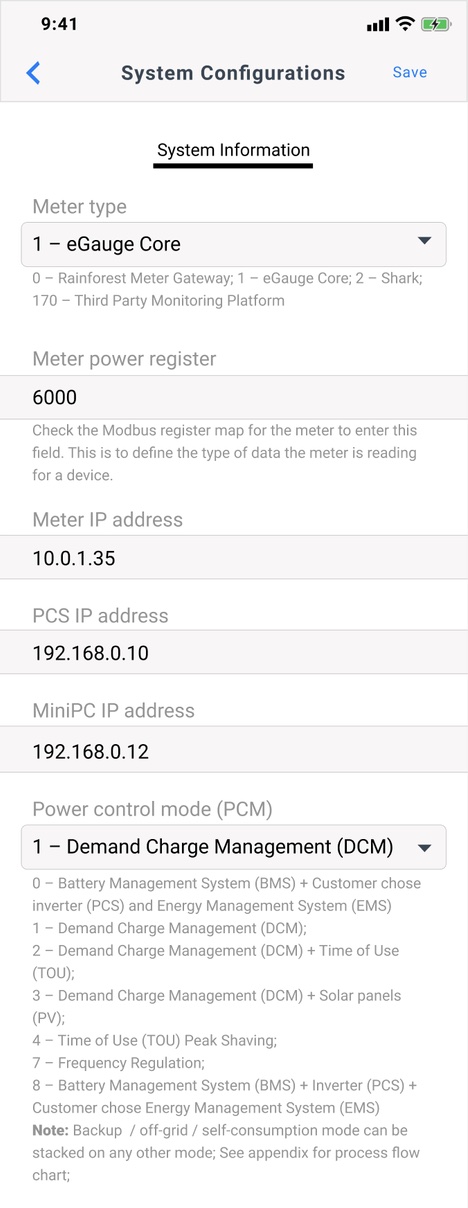
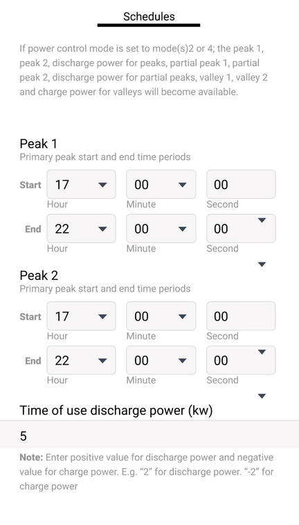
In this new system configuration editing page, we added filling instructions and annotations following each box to help users to make optimal decisions. We also refine input field design according to different prompts and give pickers with available choices to avoid invalid inputs.
06 — CHALLENGE #4 — DATA REPORT
How to make historical data useful?
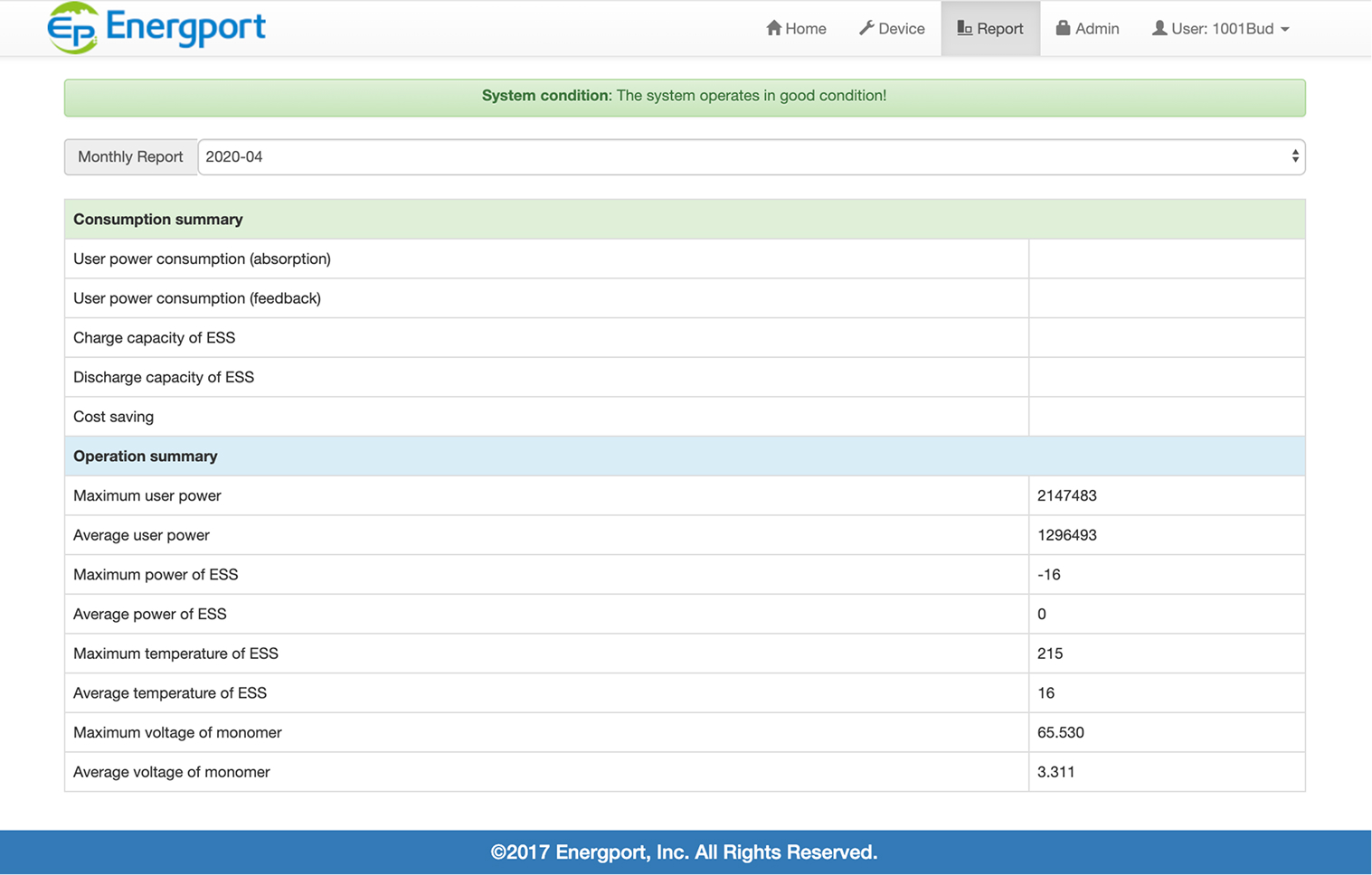
Previously, the historical data could only be visible when users exported a raw data file, which only contained rows and columns of numbers and abbreviations without any data visualization and interpretation ready for checking out.
Furthermore, we found most of our technical users who were able to read the report still had a hard time extracting certain types of data since we merged all information in one report.
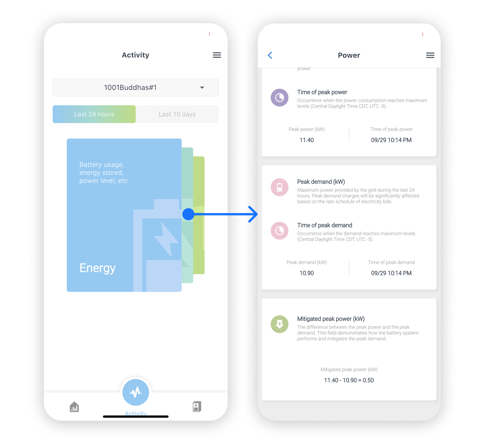
Solution: Glanceable Device History
Thus, we sorted historical data into three categories to present information more organized. Next, we gave titles and descriptions to every data type in each category and explained the concept in depth with highlights and equations.
07 — FINAL FLOW
From raw data to a daily habit
The final flow turns incoming sensor data into a simple daily summary, with clear entry points to dig deeper when needed.
- Clearer real-time updates and more intuitive data visualization
- Richer explanations of technical terms, surfaced in context
- A guided flow for editing system configuration